Page History
| Anchor | ||||
|---|---|---|---|---|
|
...
概要
| Styleclass | ||
|---|---|---|
|
...
Charts are the graphic equivalent of tables and crosstab tables. Yellowfin has a very powerful and easy-to-use charting feature which enables you to produce sophisticated and visually appealing charts to display a simple summary of your data or to represent complex relationships within it.
With Yellowfin, once you have selected the data to be used in the report, you can visualize this data in many ways simply by altering the attributes that you use in the chart.
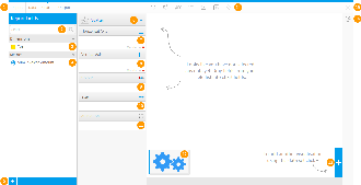
# | Function/Panel | Description |
|---|---|---|
1. | Navigation | Access various builder steps by clicking on the links in the navigation bar. The Report link provides the user with save options throughout the building process, rather than waiting until the final step.
|
2. | Report Fields Search | Search for fields to use in the chart here, accessing all fields added to the Data step of the builder.
|
3. | Report Dimension Fields | Select dimension fields to use in the chart here, accessing all fields added to the Data step of the builder.
|
4. | Report Metric Fields | Select metric fields to use in the chart here, accessing all fields added to the Data step of the builder.
|
5. | Advanced Function | Use this button to apply an Advanced Function to a field for use in the chart.
|
6. | Auto Chart Setup / Chart Type Indicator | Toggle between the Auto Chart feature, and the Chart Selection list. The Auto Chart will generate a chart based on the fields you drag into the builder, rather than you having to specify which chart to use. |
7. | Horizontal Axis Fields | Provide the field(s) to be used for the horizontal axis. Depending on the chart, this may accept multiple fields.
|
8. | Vertical Axis Fields | Provide the field(s) to be used for the vertical axis. Depending on the chart, this may accept multiple fields.
|
9. | Colour Field | Provide the field to be used for colour. Depending on the chart, this may require a Metric OR Dimension.
|
10. | Size Field | Provide the field to be used for size. This will need to be a metric field, or aggregated dimension.
|
11. | Animation Field | Provide the field to be used for animation. This will need to be a date field.
|
12. | Chart Thumbnails | This displays a thumbnail list of the charts created on this report's results.
|
13. | Add Chart Button | This button allows you to create additional charts based on the same result set.
|
14. | Formatting Menus | Access various formatting menus from this section of the navigation bar. This allows the user to apply formatting changes to elements of the chart and preview the output.
|
15. | Close Builder Button | Leave the builder using this button. |
16. | Chart Type Selection | Select the type of chart you wish to use.
|
17. | Chart Preview | View a preview of the final chart output. This preview doesn't include interactive elements such as series selection, date slider, navigation, etc. |
Yellowfinを使用すると、レポートで使用するデータを選択すれば、グラフの属性を変更するだけで、さまざまな形式でデータを視覚化することができます。
| Wiki Markup |
|---|
{html}<iframe width="700" height="394" src="https://www.youtube.com/embed/ZJSmoLT1FRs?color=white" frameborder="0" allowfullscreen></iframe>{html} |
ビルダーの要素
# | 機能/パネル | 説明 |
|---|---|---|
1. | ナビゲーション | ナビゲーションバーのリンクをクリックして、ビルダーのさまざまなステップにアクセスします。レポートが完成していなくても、作成プロセス中にいつでも「 レポート」メニューからレポートを保存することができます。詳細については、「レポート」メニューおよび「編集」メニューを参照してください。 |
2. | レポートフィールドの検索 | ここでは、ビルダーの「データ」ステップに追加されたすべてのフィールドにアクセスして、グラフで使用するフィールドを検索します。詳細については、レポートビルダー - 「データ」ステップを参照してください。 |
3. | レポートのディメンション(次元)フィールド | ここでは、ビルダーの「データ」ステップで追加されたすべてのフィールドを元に、グラフで使用するディメンション(次元)フィールドを選択します。詳細については、レポートビルダー - 「データ」ステップを参照してください。 |
4. | レポートのメトリック(数値)フィールド | ここでは、ビルダーの「データ」ステップで追加されたすべてのフィールドを元に、グラフで使用するメトリック(数値)フィールドを選択します。詳細については、レポートビルダー - 「データ」ステップを参照してください。 |
5. | 高度な関数 | このボタンを使用して、グラフで使用するフィールドに高度な関数を適用します。詳細については、高度な関数を参照してください。 |
6. | おまかせグラフ設定/グラフタイプインジケーター | おまかせグラフ機能とグラフタイプの一覧を切り替えます。おまかせグラフでは、使用するグラフを指定しなくても、ビルダーにドラッグしたフィールドに基づいてグラフが生成されます。 |
7. | 「横軸」フィールド | 横軸に使用するフィールドです。グラフによっては、複数のフィールドを使用できます。詳細については、グラフの構成要素を参照してください。 |
8. | 「縦軸」フィールド | 縦軸に使用するフィールドです。グラフによっては、複数のフィールドを使用できます。詳細については、グラフの構成要素を参照してください。 |
9. | 「色」フィールド | 色に使用するフィールドです。グラフによっては、メトリック(数値)またはディメンション(次元)が必要な場合があります。詳細については、グラフの構成要素を参照してください。 |
10. | 「サイズ」フィールド | サイズに使用するフィールドです。これはメトリック(数値)フィールドまたは要約ディメンション(次元)フィールドである必要があります。詳細については、グラフの構成要素を参照してください。 |
11. | 「アニメーション」フィールド | アニメーションに使用するフィールドです。これは日付フィールドである必要があります。詳細については、グラフの構成要素を参照してください。 |
12. | グラフのサムネイル | このレポートの結果に基づいて作成されたグラフのサムネイル一覧が表示されます。詳細については、マルチグラフを参照してください。 |
13. | 「グラフ追加」ボタン | このボタンを使用して、同じ結果セットに基づく別のグラフを作成できます。詳細については、マルチグラフを参照してください。 |
14. | 書式メニュー | ナビゲーションバーのこの部分から、さまざまな書式メニューを使用できます。これによりユーザーは、グラフエレメントに書式の変更を適用したり、表示をプレビューしたりできます。詳細については、グラフの書式を参照してください。 |
15. | ビルダーを閉じるボタン | このボタンを使用してビルダーを終了します。 |
16. | グラフタイプの選択 | 使用するグラフタイプを選択します。詳細については、グラフタイプの選択を参照してください。 |
17. | グラフのプレビュー | 最終的なグラフ表示のプレビューを表示します。このプレビューには、シリーズ選択、日付スライダー、ナビゲーションといった対話型のエレメントは含まれません。 |
注意:選択したグラフタイプに応じて、データを投入する異なる要素が表示されます。上記の例では、最も一般的な要素である横軸、縦軸、色、サイズ、アニメーションを示すために、標準の散布図を選択しています。
Note: There may be different components to be populated based on the chart type that has been selected. In the example above we have selected a standard Scatter to demonstrate the most common components; Horizontal Axis, Vertical Axis, Colour, Size, Animation.
| horizontalrule |
|---|
| Styleclass | ||
|---|---|---|
|
...