概要
手順
Yellowfin スキーチームサンプルデータセットを使用して作成した、以下の例を参照してください。
- 通常通りにレポートを作成し、必要なフィールドを追加します。こちらの関数を使用するためには、メトリック(数値)、および日付フィールドが必要です。
- スパークラインを作成するメトリック(数値)のフィールドメニューを開き、「高度な関数」を選択します。
- 高度な関数ポップアップで、関数の選択から「分析」を選択します。関数の一覧から、「スパークライン配列分析関数」を選択します。
- ポップアップに追加の設定項目が表示されたら、日付フィールドを選択します。このフィールドは、配列を作成するために、メトリック(数値)値を集約します。メトリック(数値)ロウ(行)配列は、複数の日付からのデータを表示するために、レポートテーブルには空欄で表示されることに注意してください。空欄の日付フィールドを非表示にすることもできます。
- 次に、日付フィールドの欠損値を埋める方法を指定します。選択肢は、以下の通りです。
- 欠損値のデータを入力しない:日付フィールドの欠損値を無視します。
- 観察値を使用する:選択したデータカラム(列)のすべてのロウ(行)からの観測値で欠損値にデータを入力します。
- Then specify whether or not to use scaling value for the sparkline. Scaling enables the chart to scale lines by observing values of all rows. If left unscaled, a sparkline with smaller values, such as 10, 21, 35, and so on, might look similar to a sparkline with drastically different values that have similar value differences, such as 100, 210, 350, and so on.
- Click Save.
- You will notice an array of aggregated metric values in a single row, as shown in the example below.
- Now you must convert the values into sparklines. Bring up the same metric column’s menu and select Format, and then Edit. This opens the column formatting popup.
- Select Sparkline Formatter as the Format in the popup. This will bring up other formatting configurations.
- Specify the width and height or the sparkline.
- Enable the Includes Scaling Value toggle if you had enabled scaling in the Sparkline Array advanced function. This is important, because otherwise the sparkline data will appear wrong.
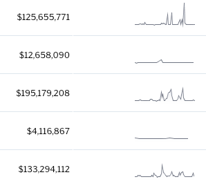
- Close the column formatting popup, to view the sparkline in the report table (shown in the example below).
- You can also choose to select Column as the Sparkline Type in the column formatting popup to view column charts in the report.
- Save your report or proceed as you normally would.


