Page History
...
| Table of Contents | ||
|---|---|---|
|
...
はじめに
| Styleclass | ||
|---|---|---|
| ||
GIS from a Non-GIS Supported Database
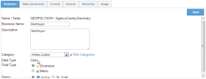
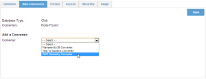
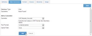
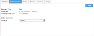
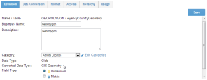
Not all databases support GIS natively. However, Yellowfin can convert VARCHAR fields into polygons. So if your data base does not have a GIS field type you can still store your GIS polygons in that database as a VARCHAR.
GISがサポートされていないデータベースからのGIS
すべてのデータベースがネイティブでGISをサポートしているわけではありません。ただし、Yellowfinでは、VARCHARフィールドをポリゴンに変換できます。したがって、データベースにGISフィールドタイプがない場合でも、そのデータベース内のGISポリゴンをVARCHARとして保存することができます。
このセクションでは、VARCHARとして保存されたポリゴンでフィールドを書式設定する方法を示します。This Section shows you how to format a field with a polygon stored as a VARCHAR.
| Section | ||||||||||
|---|---|---|---|---|---|---|---|---|---|---|
|
| Section | ||||||||||
|---|---|---|---|---|---|---|---|---|---|---|
|
| Section | ||||||||||
|---|---|---|---|---|---|---|---|---|---|---|
|

| Section | ||||||||||
|---|---|---|---|---|---|---|---|---|---|---|
|
| Section | ||||||||||
|---|---|---|---|---|---|---|---|---|---|---|
|

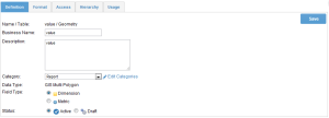
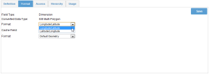
GIS from a Supported Database
サポートされているデータベースからのGIS
データソースが、MySQL、Oracle、PostgreSQLまたはMS SQL Server 2008などのGISカラム(列)をサポートしている場合は、レポート用に直接これらのカラム(列)に接続できます。
このタイプのフィールドはチュートリアルデータベースでは使用できませんが、以下は、ビューでフィールドタイプを設定するためのクイックガイドになります。If your data source supports GIS columns such as MySQL, Oracle, PostgreSQL or MS SQL Server 2008 you can connect to these directly for reporting.
This type of field is not available in the Tutorial database but below is a quick guide to setting the field types at the view.
| Section | ||||||||||
|---|---|---|---|---|---|---|---|---|---|---|
|
| Section | ||||||||||
|---|---|---|---|---|---|---|---|---|---|---|
|
...
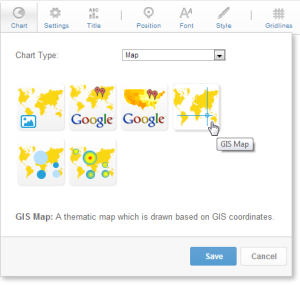
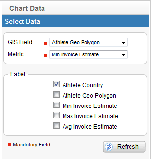
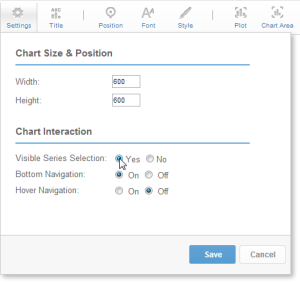
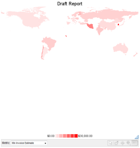
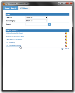
GISマップチュートリアル
| Styleclass | ||
|---|---|---|
| ||
| Section | ||||||||||
|---|---|---|---|---|---|---|---|---|---|---|
|
| Section | ||||||||||
|---|---|---|---|---|---|---|---|---|---|---|
|
| Section | ||||||||||
|---|---|---|---|---|---|---|---|---|---|---|
|

| Section | ||||||||||
|---|---|---|---|---|---|---|---|---|---|---|
|
| Section | ||||||||||
|---|---|---|---|---|---|---|---|---|---|---|
|
| Section | ||||||||||
|---|---|---|---|---|---|---|---|---|---|---|
|
| Section | ||||||||||
|---|---|---|---|---|---|---|---|---|---|---|
|

| Section | ||||||||||
|---|---|---|---|---|---|---|---|---|---|---|
|
| Section | ||||||||||
|---|---|---|---|---|---|---|---|---|---|---|
|
| Section | ||||||||||
|---|---|---|---|---|---|---|---|---|---|---|
|

| Section | ||||||||||
|---|---|---|---|---|---|---|---|---|---|---|
|
| horizontalrule |
|---|
| Styleclass | ||
|---|---|---|
| ||