Page History
...
| Table of Contents | ||
|---|---|---|
|
...
概要
| Styleclass | ||
|---|---|---|
| ||
Typeタイプ | Iconアイコン | When to Use |
|---|---|---|
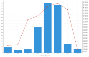
Combination Charts |
| Combination charts, in effect, superimpose one chart type above or below another. Use to improve clarity and highlight relationships between data sets. |
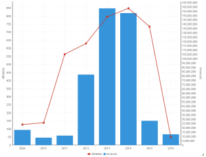
Overlay Chart |
| Use the line chart to emphasize a trend and bars to emphasize specific values. Line/Bar combinations may work better by de-emphasizing bars through the use of subtle colours. |


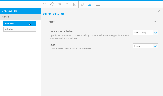
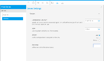
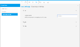
Chart Data Options
Option | Description |
|---|---|
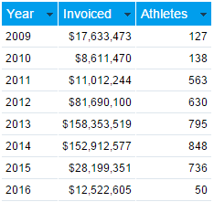
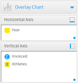
Horizontal Axis | This is the category label for the X axis |
Vertical Axis | Typically a numeric value such as $. An item that you want to measure on your Chart |
Colour | This option is only available if you have a cross tab data set available and is used to determine the colour applied for cross tab series data. |
...
主な用途 | ||
|---|---|---|
コンビネーショングラフ |
| 関連する値を使った2つのグラフを同時に表示します。データ間の関係を強調し、より明確に表現できます。 |
オーバーレイグラフ |
| 1つのグラフに別のグラフを重ねて、データの違いを際立たせます。線と棒の組み合わせは微妙な色を使って強調された棒グラフより効果的です。 |
グラフデータオプション
オプション | 説明 |
|---|---|
横軸 | X軸のカテゴリーラベル。 |
縦軸 | $などが代表的な数値型の値です。グラフ上で測定するアイテムです。 |
色 | このオプションはクロス集計のデータがある場合にだけ使用できます。このオプションでクロス集計のシリーズデータに適用する色を指定します。 |
コンビネーショングラフチュートリアル
| Styleclass | ||
|---|---|---|
| ||
Summary
In order to set up a Combination Chart you will need:
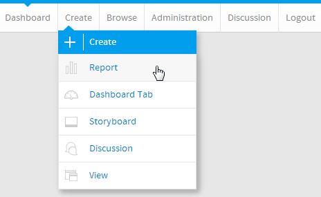
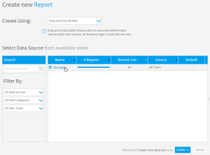
- Create a report with chart display
- Select a field to use as the Label
- Select field(s) to use as the Metrics
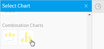
- Create your chart, selecting Overlay as the type
- Provide the Horizontal Axis and Vertical Axis fields
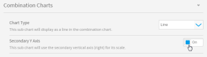
- Customise the Chart as required, creating a second chart and assigning metric(s) to it
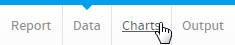
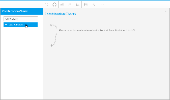
- Close the Chart Builder
- Save your report
...
サマリー
コンビネーショングラフを設定するには、以下のステップを実行する必要があります。
- グラフ表示するレポートを作成します。
- ラベルとして使用するフィールドを選択します。
- メトリック(数値)として使用するフィールドを選択します。
- タイプとしてオーバーレイグラフを選択してグラフを作成します。
- 「横軸」フィールドおよび「縦軸」フィールドに入力します。
- 2番目のグラフの作成やメトリック(数値)の割り当て等、必要に応じてグラフをカスタマイズします。
- グラフビルダーを閉じます。
- レポートを「保存」します。
チュートリアル
| Section | ||||||||||
|---|---|---|---|---|---|---|---|---|---|---|
|
| Section | ||||||||||
|---|---|---|---|---|---|---|---|---|---|---|
|
| Section | ||||||||||
|---|---|---|---|---|---|---|---|---|---|---|
|
| Section | ||||||||||
|---|---|---|---|---|---|---|---|---|---|---|
|
| Section | ||||||||||
|---|---|---|---|---|---|---|---|---|---|---|
|
| Section | ||||||||||
|---|---|---|---|---|---|---|---|---|---|---|
|
| Section | ||||||||||
|---|---|---|---|---|---|---|---|---|---|---|
|
| Section | ||||||||||
|---|---|---|---|---|---|---|---|---|---|---|
|
| Section | ||||||||||
|---|---|---|---|---|---|---|---|---|---|---|
|
| Section | ||||||||||
|---|---|---|---|---|---|---|---|---|---|---|
|
| Section | ||||||||||
|---|---|---|---|---|---|---|---|---|---|---|
|
| Section | ||||||||||
|---|---|---|---|---|---|---|---|---|---|---|
|
| Section | ||||||||||
|---|---|---|---|---|---|---|---|---|---|---|
|
| horizontalrule |
|---|
| Styleclass | ||
|---|---|---|
| ||