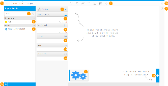
Overview
Charts are the graphic equivalent of tables and crosstab tables. Yellowfin has a very powerful and easy-to-use charting feature which enables you to produce sophisticated and visually appealing charts to display a simple summary of your data or to represent complex relationships within it.
With Yellowfin, once you have selected the data to be used in the report, you can visualize this data in many ways simply by altering the attributes that you use in the chart.
# |
Function/Panel |
Description |
|---|---|---|
1. |
Navigation |
Access various builder steps by clicking on the links in the navigation bar. The Report link provides the user with save options throughout the building process, rather than waiting until the final step.
|
2. |
Report Fields Search |
Search for fields to use in the chart here, accessing all fields added to the Data step of the builder.
|
3. |
Report Dimension Fields |
Select dimension fields to use in the chart here, accessing all fields added to the Data step of the builder.
|
4. |
Report Metric Fields |
Select metric fields to use in the chart here, accessing all fields added to the Data step of the builder.
|
5. |
Advanced Function |
Use this button to apply an Advanced Function to a field for use in the chart.
|
6. |
Auto Chart Setup / Chart Type Indicator |
Toggle between the Auto Chart feature, and the Chart Selection list. The Auto Chart will generate a chart based on the fields you drag into the builder, rather than you having to specify which chart to use. |
7. |
Horizontal Axis Fields |
Provide the field(s) to be used for the horizontal axis. Depending on the chart, this may accept multiple fields.
|
8. |
Vertical Axis Fields |
Provide the field(s) to be used for the vertical axis. Depending on the chart, this may accept multiple fields.
|
9. |
Colour Field |
Provide the field to be used for colour. Depending on the chart, this may require a Metric OR Dimension.
|
10. |
Size Field |
Provide the field to be used for size. This will need to be a metric field, or aggregated dimension.
|
11. |
Animation Field |
Provide the field to be used for animation. This will need to be a date field.
|
12. |
Chart Thumbnails |
This displays a thumbnail list of the charts created on this report's results.
|
13. |
Add Chart Button |
This button allows you to create additional charts based on the same result set.
|
14. |
Formatting Menus |
Access various formatting menus from this section of the navigation bar. This allows the user to apply formatting changes to elements of the chart and preview the output.
|
15. |
Close Builder Button |
Leave the builder using this button. |
16. |
Chart Type Selection |
Select the type of chart you wish to use.
|
17. |
Chart Preview |
View a preview of the final chart output. This preview doesn't include interactive elements such as series selection, date slider, navigation, etc. |
Note: There may be different components to be populated based on the chart type that has been selected. In the example above we have selected a standard Scatter to demonstrate the most common components; Horizontal Axis, Vertical Axis, Colour, Size, Animation.

