Overview
Type |
Icon |
When to Use |
|---|---|---|
Meter |
|
You want to measure the rate of change of a measure against pre-defined targets. Useful for dashboard reporting. |
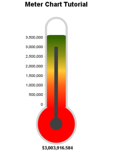
Thermometer |
|
Vertical representation of the meter chart, indicating a range of qualitative indicators. |
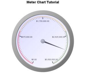
Dial |
|
Used to communicate key performance indicators. |
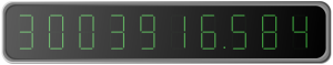
Numeric Display |
|
Shows the value of a metric on a digital display. |


Chart Data Options
Option |
Description |
|---|---|
Series |
Typically a numeric value such as $. An item that you want to measure on your Chart |
Meter Chart Tutorial
Summary
In order to set up a Meter Chart you will need:
- Create a report with chart display
- Select a field to use as the Metric
- Create your chart, selecting Meter as the type
- Provide the Metric option and Refresh
- Customise the Chart as required
- Close the Chart Builder
- Apply Conditional Formatting if the chart requires it
- Save your report
Tutorial
1. Start creating a chart as you did with the other charts by clicking on the Create link.
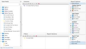
2. On the Report Data page, drag and drop the  Invoiced (Pref Currency) metric into the Column Fields area, and the
  Invoiced Date field into the Filters area.
3. Make sure that you select the Chart Only option as you have for the other charts.
4. Click on  at the top of the page to move to the next step.
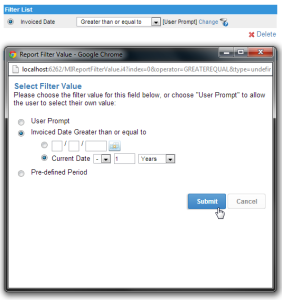
5. On the Filters page, set Invoiced Date to be Greater than or equal to.
6. Click on the Change link to set the value.
7. Select Current Date - 1 Year.
Note: You may need to change the number of years to get results. Try 2, 3, etc. until there is sample data.
8. Click Submit to save your changes.
9. Click on at the top of the page to move to the next step.
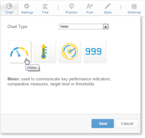
10. On the Report Preview page, click on the Pie Chart image as before.
11. Click on the Chart Menu and select Meter as the Chart Type and Meter as the subtype (click on the picture on the left).
12. Click Save to load the options for a Meter Chart.
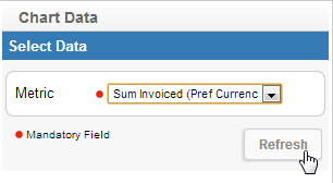
13. Set the Chart Data settings.
14. Select Sum Invoiced (Pref Currency) for the Metric.
15. Click Refresh to generate your chart.
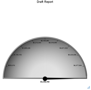
16. You should now have a chart that looks like this.
17. Click on the  Close button to go back to the Report Preview page.
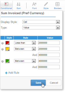
18. Now you are going to add some coloured Conditional Formatting Alerts to your chart.
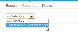
19. Now select the Columns tab at the top of the page and select Sum Invoiced (Pref Currency) from the drop down menu.
20. Click on the Conditional Menu under the Data Format header to.
21. Click on the Add Rule link to add a conditional formatting rule to your chart.
22. Leave the Display Style set to Cell, this means that the colour of the cell (if it were in a table) would be changed according to the rules set, or in this case, the colour of the meter section that matches each rule.
23. Leave the Type to Value, meaning that the value of the field will be compared to a value set in the rule (which you will do next), rather that being compared to another column or %.
24. Set the first rule to Red, Less than 2000000. This will colour any section of the chart where the value is less than 2,000,000.
25. Set the second rule to Yellow, Between 2000000 and 4000000
26. Set the third rule to Green, Between 4000000 and 6000000.
27. Click Save to apply the rules to your chart.
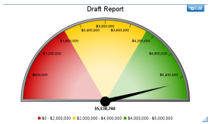
28. Your chart should now look like this.
29. Using the same steps as before, Save and Activate your Chart.
30. Click on the Close button to go back to the Report Preview page.
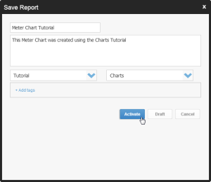
31. Click on the Save Menu and use Meter Chart Tutorial as the Name.
32. Type This Meter Chart was created using the Charts Tutorial as the Description.
33. Enter Tutorial as the Category and Charts as the Sub Category.
34. Click Activate.
The steps you just followed can be applied to the other meter chart types by simply changing the selection made in Step 11. Below are examples of Thermometer, Dial, and Numeric Display charts.