Page History
...
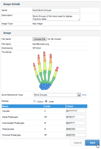
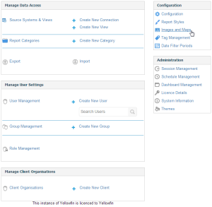
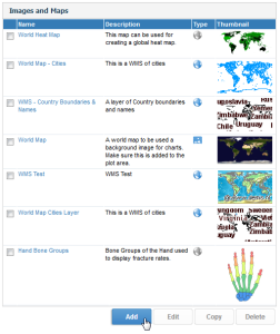
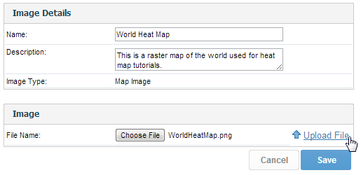
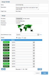
There are two styles of heat maps available using Yellowfin. Those created from GIS data or those created via an image (Raster Map). The image will contain all the regions for your data. These images work by substituting a unique colour in your image with a new colour based on the value of data in your report.
To begin making Raster Maps you will need to have:
- An image with each 'Zone' ‘Zone’ defined by a unique colour (JPG or PNG)
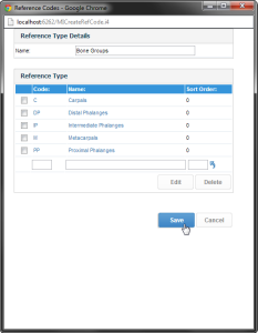
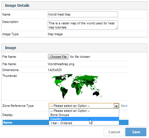
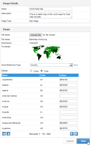
- Reference Code data that allows you to match each map zone to reference data. (In the tutorial we have Country as a Ref Code - – so that we can map each zone to a country code which will then be used for our data).
Note: the examples contained in this Getting Started section do not use the Ski Team data or supplied image. The examples for you to follow along with begin in the Setting up a Map via Administration Options section.
...
- The image should contain all areas you wish to assign data to. For example, if you wanted to map revenue by states of Australia, you would need a full map of Australia. A World map would not be suitable here, nor would a map of half of Australia.
- The image should only contain elements you wish to be displayed in the final map. This means that if you found a map of Australia, the image should not contain a background of surrounding water and land masses unless you wish these areas to be displayed in the final map.
Note: any area that does not have data assigned to it will display as found in the original image. - The image should be of a high enough resolution so that you can resize the final map without losing clarity. This means that the image needs to be the size you wish to display your final map, or larger, so that edges and backgrounds do not appear blurred when resized.
...
| Section | ||||||||||
|---|---|---|---|---|---|---|---|---|---|---|
|
...
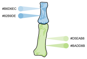
When you have a clean image you are ready to start assigning colours to the data areas.
Note: the cleaning process will require the use of image editing software.
...
| Section | ||||||||||||||||||||||||||||
|---|---|---|---|---|---|---|---|---|---|---|---|---|---|---|---|---|---|---|---|---|---|---|---|---|---|---|---|---|
|
Note: colouring the image will require the use of image editing software.
...
| Section | ||||||||||
|---|---|---|---|---|---|---|---|---|---|---|
|
| Section | ||||||||||
|---|---|---|---|---|---|---|---|---|---|---|
|
...
| Section | ||||||||||
|---|---|---|---|---|---|---|---|---|---|---|
|
| Section | ||||||||||
|---|---|---|---|---|---|---|---|---|---|---|
|
| Section | ||||||||||
|---|---|---|---|---|---|---|---|---|---|---|
|

...
| Section | ||||||||||
|---|---|---|---|---|---|---|---|---|---|---|
|
| Section | ||||||||||
|---|---|---|---|---|---|---|---|---|---|---|
|
...
| Section | ||||||||||
|---|---|---|---|---|---|---|---|---|---|---|
|
| Section | ||||||||||
|---|---|---|---|---|---|---|---|---|---|---|
|
...
| Section | ||||||||||
|---|---|---|---|---|---|---|---|---|---|---|
|
...