Page History
...
| Table of Contents | ||
|---|---|---|
|
...
概要
| Styleclass | ||
|---|---|---|
| ||
注意: 示されるメニューおよびメニュー内の項目は、使用するグラフのタイプによって異なります。Note: the menus and items contained within them will change based on the type of chart you are using.
| Wiki Markup |
|---|
{html}<iframe width="700" height="394" src="https://www.youtube.com/embed/YbZqgqKJ_C0LVICB2vLtL8?color=white" frameborder="0" allowfullscreen></iframe>{html} |
...
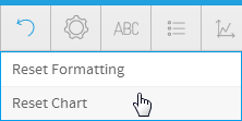
リセット
| Styleclass | ||
|---|---|---|
| ||
- Formatting: this will reset your formatting selections, but keep the chart type and field selections defined.
- Chart: this will reset your chart, including all formatting, field, and chart type selections, returning it to an empty state.
- 書式:選択した書式がリセットされますが、定義されているグラフタイプおよびフィールドの選択は保持されます。
- グラフ:すべての書式とフィールド、グラフタイプの選択を含め、グラフがリセットされ、空の状態に戻されます。
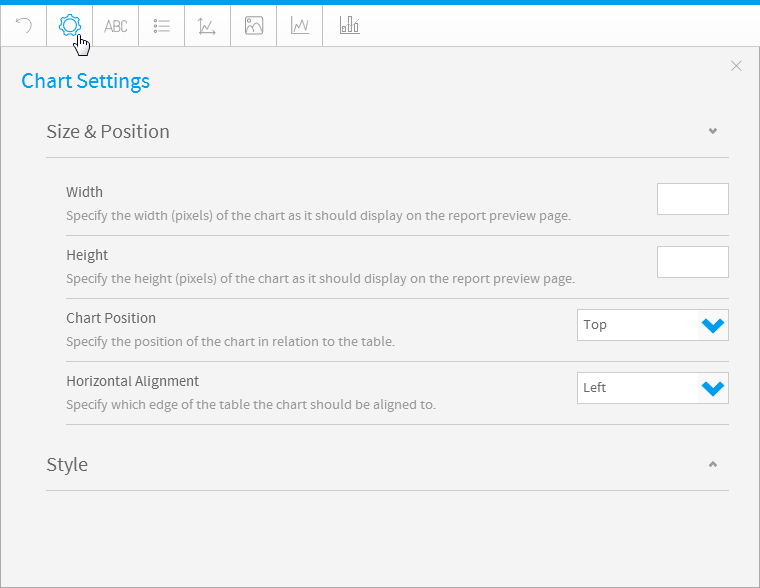
グラフの設定
...
| Styleclass | ||
|---|---|---|
| ||
| Expand | ||||||||||||||||||
|---|---|---|---|---|---|---|---|---|---|---|---|---|---|---|---|---|---|---|
| ||||||||||||||||||
|
| Expand | ||||||||||
|---|---|---|---|---|---|---|---|---|---|---|
| ||||||||||
|
| Expand | ||||||||||||||||||||||||||||||||||||||||||||||||||||||||
|---|---|---|---|---|---|---|---|---|---|---|---|---|---|---|---|---|---|---|---|---|---|---|---|---|---|---|---|---|---|---|---|---|---|---|---|---|---|---|---|---|---|---|---|---|---|---|---|---|---|---|---|---|---|---|---|---|
| ||||||||||||||||||||||||||||||||||||||||||||||||||||||||
|
| Expand | ||||||||||||||||||||||
|---|---|---|---|---|---|---|---|---|---|---|---|---|---|---|---|---|---|---|---|---|---|---|
| ||||||||||||||||||||||
|
| Expand | ||||||
|---|---|---|---|---|---|---|
| ||||||
|
| Expand | ||||||||||||||||
|---|---|---|---|---|---|---|---|---|---|---|---|---|---|---|---|---|
| ||||||||||||||||
|
| Expand | ||||||
|---|---|---|---|---|---|---|
| ||||||
|
| Expand | ||||
|---|---|---|---|---|
| ||||
|
| Expand | ||||||||||||
|---|---|---|---|---|---|---|---|---|---|---|---|---|
| ||||||||||||
|
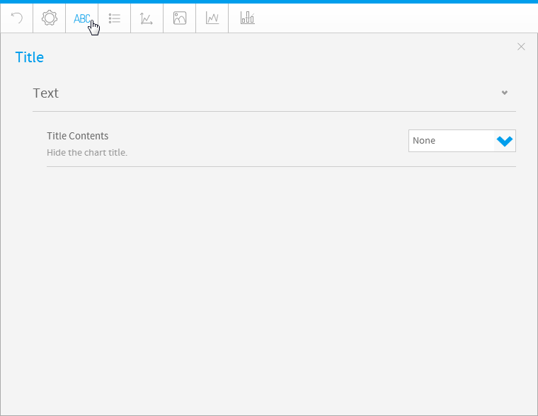
Title
| Styleclass | ||
|---|---|---|
| ||
| Expand | ||||||||
|---|---|---|---|---|---|---|---|---|
| ||||||||
|
Legend
| Styleclass | ||
|---|---|---|
| ||
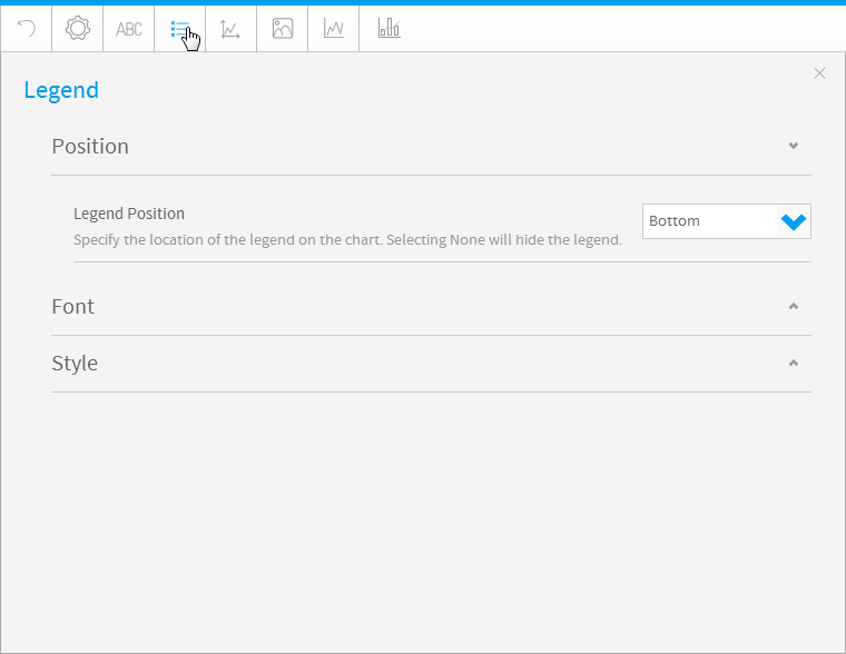
| Expand | ||||
|---|---|---|---|---|
| ||||
|
| Expand | ||||
|---|---|---|---|---|
| ||||
|
| Expand | ||||||||||
|---|---|---|---|---|---|---|---|---|---|---|
| ||||||||||
|
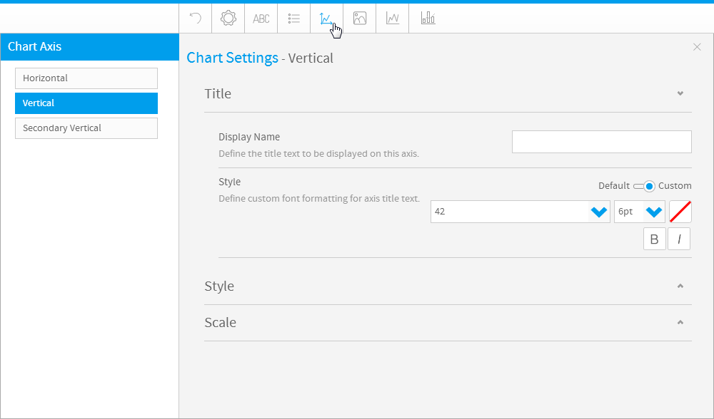
Axis
| Styleclass | ||
|---|---|---|
| ||
| Expand | ||||||
|---|---|---|---|---|---|---|
| ||||||
|
| Expand | ||||||||||||||||||||||||||||||||||||||
|---|---|---|---|---|---|---|---|---|---|---|---|---|---|---|---|---|---|---|---|---|---|---|---|---|---|---|---|---|---|---|---|---|---|---|---|---|---|---|
| ||||||||||||||||||||||||||||||||||||||
The Axis style drop down lets you determine the formats to be applied to axis.
|
| Expand | ||||||||||||
|---|---|---|---|---|---|---|---|---|---|---|---|---|
| ||||||||||||
The Axis scale drop down lets you determine the scale dimensions. Generally you will only be able to set the Y Axis attributes – unless you are using XY charts in which case you can set both X & Y attributes.
|
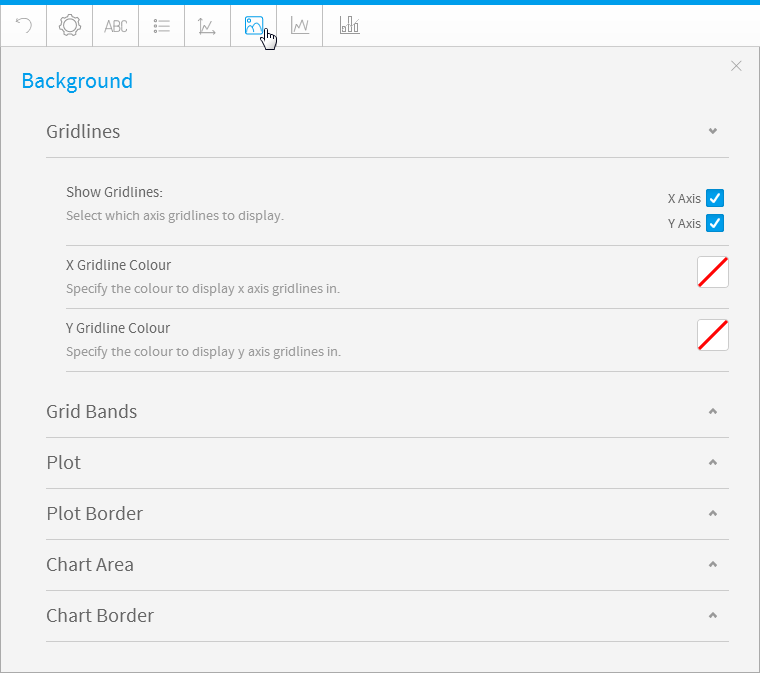
Background
| Styleclass | ||
|---|---|---|
| ||
| Expand | ||||||||
|---|---|---|---|---|---|---|---|---|
| ||||||||
Gridline options are available for all category charts, bubble and scatter charts.
|
| Expand | ||||||
|---|---|---|---|---|---|---|
| ||||||
Gridline options are available for all category charts, bubble and scatter charts.
|
| Expand | ||||||||||||
|---|---|---|---|---|---|---|---|---|---|---|---|---|
| ||||||||||||
The plot area is the area bounded by the axes, including all data series. The drop down options let you set the background colours applied to the plot area.
|
| Expand | ||||||||
|---|---|---|---|---|---|---|---|---|
| ||||||||
The plot area is the area bounded by the axes, including all data series. The drop down options let you set the background colours applied to the plot area.
|
| Expand | ||||||||||||
|---|---|---|---|---|---|---|---|---|---|---|---|---|
| ||||||||||||
The entire chart and all its elements are described as the chart area. The drop down options let you set the background colours applied to the chart area.
|
| Expand | ||||||||
|---|---|---|---|---|---|---|---|---|
| ||||||||
The entire chart and all its elements are described as the chart area. The drop down options let you set the background colours applied to the chart area.
|
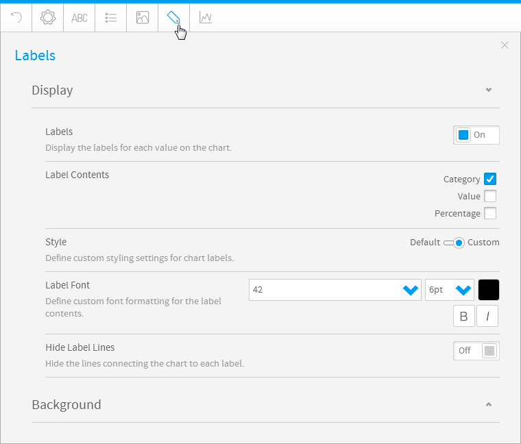
Labels
| Styleclass | ||
|---|---|---|
| ||
| Expand | ||||||||||||
|---|---|---|---|---|---|---|---|---|---|---|---|---|
| ||||||||||||
|
| Expand | ||||||||||||||||
|---|---|---|---|---|---|---|---|---|---|---|---|---|---|---|---|---|
| ||||||||||||||||
|
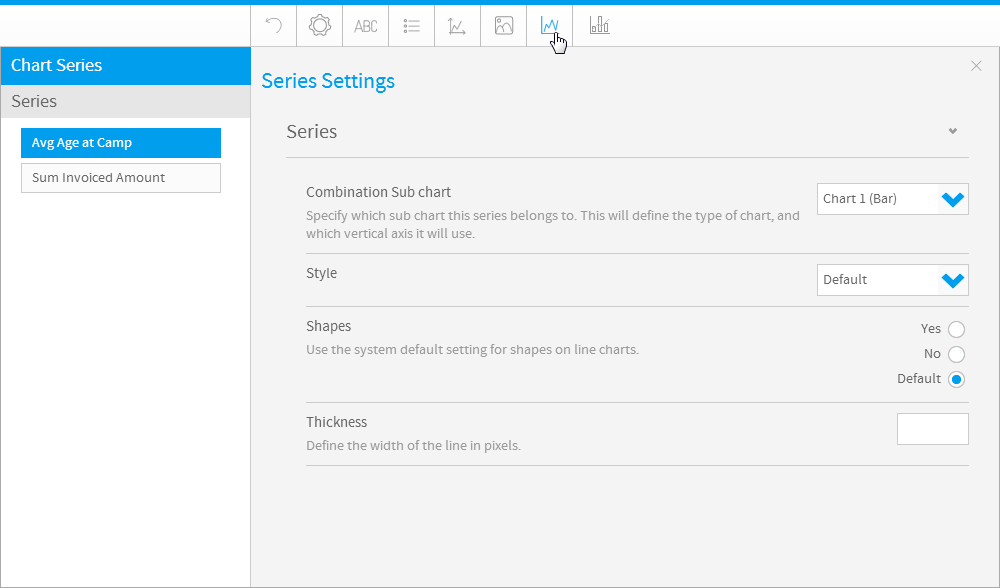
Series
| Styleclass | ||
|---|---|---|
| ||
| Expand | ||||||||||||||
|---|---|---|---|---|---|---|---|---|---|---|---|---|---|---|
| ||||||||||||||
|
| Expand | ||||||
|---|---|---|---|---|---|---|
| ||||||
|
|
| Expand | ||||||||||||||||||||||
|---|---|---|---|---|---|---|---|---|---|---|---|---|---|---|---|---|---|---|---|---|---|---|
| ||||||||||||||||||||||
|
| Expand | ||||||
|---|---|---|---|---|---|---|
| ||||||
|
| Expand | ||||||||||||||||
|---|---|---|---|---|---|---|---|---|---|---|---|---|---|---|---|---|
| ||||||||||||||||
|
| Expand | ||||||
|---|---|---|---|---|---|---|
| ||||||
|
| Expand | ||||
|---|---|---|---|---|
| ||||
|
| Expand | ||||||||||||
|---|---|---|---|---|---|---|---|---|---|---|---|---|
| ||||||||||||
|
タイトル
| Styleclass | ||
|---|---|---|
| ||
| Expand | ||||||||
|---|---|---|---|---|---|---|---|---|
| ||||||||
|
凡例
| Styleclass | ||
|---|---|---|
| ||
| Expand | ||||
|---|---|---|---|---|
| ||||
|
| Expand | ||||
|---|---|---|---|---|
| ||||
|
| Expand | ||||||||||
|---|---|---|---|---|---|---|---|---|---|---|
| ||||||||||
|
軸
| Styleclass | ||
|---|---|---|
| ||
| Expand | ||||||
|---|---|---|---|---|---|---|
| ||||||
|
| Expand | ||||||||||||||||||||||||||||||||||||||
|---|---|---|---|---|---|---|---|---|---|---|---|---|---|---|---|---|---|---|---|---|---|---|---|---|---|---|---|---|---|---|---|---|---|---|---|---|---|---|
| ||||||||||||||||||||||||||||||||||||||
軸のスタイルのドロップダウンメニューでは、軸に適用する書式を指定します。
|
| Expand | ||||||||||||
|---|---|---|---|---|---|---|---|---|---|---|---|---|
| ||||||||||||
このドロップダウンメニューを使って属性を設定できるのは通常はY軸に対してのみですが、XYグラフを使用していればX軸とY軸の両方に属性を設定できます。
|
背景
| Styleclass | ||
|---|---|---|
| ||
| Expand | ||||||||
|---|---|---|---|---|---|---|---|---|
| ||||||||
グリッド線オプションは、すべてのカテゴリーグラフやバブルグラフ、散布図で利用することができます。
|
| Expand | ||||||
|---|---|---|---|---|---|---|
| ||||||
グリッド線オプションは、すべてのカテゴリーグラフやバブルグラフ、散布図で利用することができます。
|
| Expand | ||||||||||||
|---|---|---|---|---|---|---|---|---|---|---|---|---|
| ||||||||||||
描画域は軸で区切られた領域で、この中にすべてのデータシリーズが表示されます。ドロップダウンメニューのオプションで、描画域に適用する背景色を設定することができます。
|
| Expand | ||||||||
|---|---|---|---|---|---|---|---|---|
| ||||||||
描画域は軸で区切られた領域で、この中にすべてのデータシリーズが表示されます。ドロップダウンメニューのオプションで、描画域に適用する背景色を設定することができます。
|
| Expand | ||||||||||||
|---|---|---|---|---|---|---|---|---|---|---|---|---|
| ||||||||||||
グラフ全体とそのエレメントはグラフ域として説明されます。ドロップダウンメニューのオプションで、グラフ域に適用する背景色を選択することができます。
|
| Expand | ||||||||
|---|---|---|---|---|---|---|---|---|
| ||||||||
グラフ全体とそのエレメントはグラフ域として説明されます。ドロップダウンメニューのオプションで、グラフ域に適用する背景色を選択することができます。
|
ラベル
| Styleclass | ||
|---|---|---|
| ||
オプション | 説明 |
|---|---|
ラベル | グラフ上の各値にラベルを表示します。 |
ラベルコンテンツ | 必要に応じて、ラベルの内容を指定します。
|
スタイル | グラフの凡例に書式を定義します。 |
ラベルのフォント | ラベルコンテンツにカスタムフォント書式を定義します。 |
ラベル線を非表示化 | グラフと各ラベルをつなぐ線を表示または非表示にします。 |
| Expand | ||||||||||||||||
|---|---|---|---|---|---|---|---|---|---|---|---|---|---|---|---|---|
| ||||||||||||||||
|
シリーズ
| Styleclass | ||
|---|---|---|
| ||
| Expand | ||||||||||||||
|---|---|---|---|---|---|---|---|---|---|---|---|---|---|---|
| ||||||||||||||
|
| Expand | ||||||
|---|---|---|---|---|---|---|
| ||||||
|
| Expand | ||||||
|---|---|---|---|---|---|---|
| ||||||
| ||||||
| Expand | ||||||
| ||||||
|
| Expand | ||||||
|---|---|---|---|---|---|---|
| ||||||
|
| Expand | |||||||||||||||
|---|---|---|---|---|---|---|---|---|---|---|---|---|---|---|---|
| |||||||||||||||
|
...
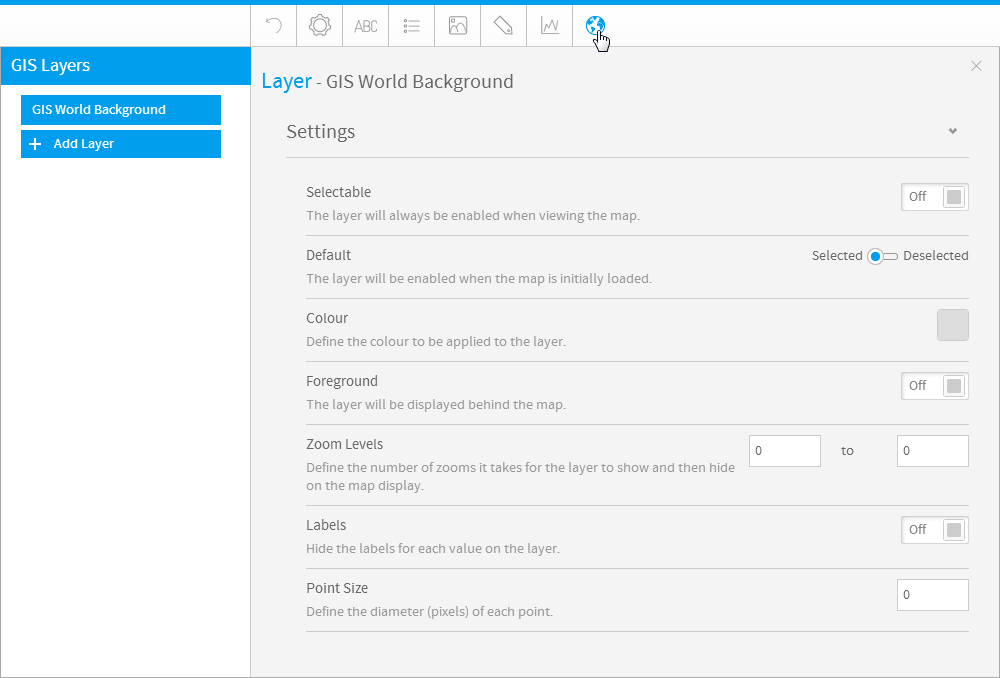
GIS設定
| Styleclass | ||
|---|---|---|
| ||
| Expand | ||||||||||||||||||
|---|---|---|---|---|---|---|---|---|---|---|---|---|---|---|---|---|---|---|
| ||||||||||||||||||
|
...
|
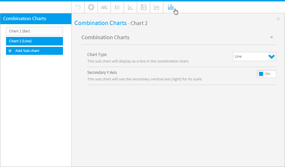
コンビネーショングラフ
| Styleclass | ||
|---|---|---|
| ||
| Expand | ||||||||||
|---|---|---|---|---|---|---|---|---|---|---|
| ||||||||||
|
| horizontalrule |
|---|
| Styleclass | ||
|---|---|---|
| ||