Page History
...
| Table of Contents | ||
|---|---|---|
|
...
概要
| Styleclass | ||
|---|---|---|
| ||
Typeタイプ | Iconアイコン | When to Use主な用途 |
|---|---|---|
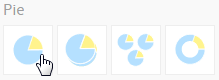
Pie円グラフ |
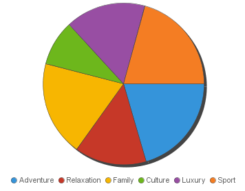
| You want to show the relationship of parts to the whole. Use a pie chart to highlight proportions rather than actual values. If it is important to show actual values in the chart, avoid using the pie chart type. |
3D Pie |
| Similar to the pie chart, but in three a dimensional form. |
Multi Pie |
| Used to highlight individual component sizes in a system of multiple components. |
Ring |
| Similar to the pie chart, but in a circular ring form. |


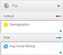
Chart Data Options
Option | Description |
|---|---|
Colour | This is the category label for the X axis |
Size | Typically a numeric value such as $. An item that you want to measure on your Chart |
...
全体に対する部分の関係を見るのに適しています。実際の値よりむしろ割合を示します。実際の値を図によって示す場合には使うべきではないでしょう。 | ||
3D円グラフ |
| 円グラフと似ていますが、3次元で表示されます。 |
マルチ円グラフ |
| 全体構成の中で個々のサブ構成の状態を強調するときに使用します。 |
リング円グラフ |
| 円グラフと似ていますが、リング型で表示されます。 |
グラフデータオプション
オプション | 説明 |
|---|---|
色 | X軸のカテゴリーラベル。 |
サイズ | $などが代表的な数値型の値です。グラフ上で測定するアイテムです。 |
円グラフチュートリアル
| Styleclass | ||
|---|---|---|
| ||
Summary
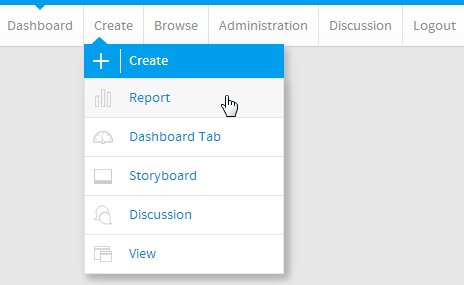
In order to set up a Pie Chart you will need:
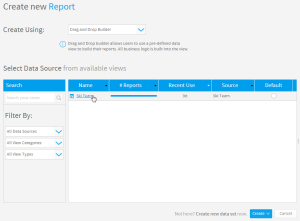
- Create a report with chart display
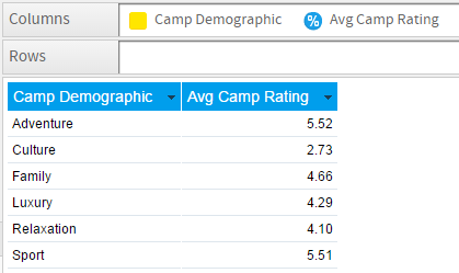
- Select a field to use as the Colour
- Select a field to use as the Size
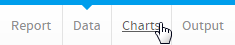
- Create your chart, selecting Pie as the type
- Provide the Colour and Size options
- Customise the Chart as required
- Proceed to the Output step
- Save your report
...
サマリー
円グラフを設定するには、以下のステップを実行する必要があります。
- グラフ表示されるレポートを作成します。
- 色として使用するフィールドを選択します。
- サイズとして使用するフィールドを選択します。
- タイプとして円グラフを選択してグラフを作成します。
- 「色」および「サイズ」オプションを入力します。
- 必要に応じてグラフをカスタマイズします。
- 「表示」ステップに進みます。
- レポートを「保存」します。
チュートリアル
| Section | ||||||||||
|---|---|---|---|---|---|---|---|---|---|---|
|
| Section | ||||||||||
|---|---|---|---|---|---|---|---|---|---|---|
|
| Section | ||||||||||
|---|---|---|---|---|---|---|---|---|---|---|
|
| Section | ||||||||||
|---|---|---|---|---|---|---|---|---|---|---|
|
| Section | ||||||||||
|---|---|---|---|---|---|---|---|---|---|---|
|
| Section | ||||||||||
|---|---|---|---|---|---|---|---|---|---|---|
|
| Section | ||||||||||
|---|---|---|---|---|---|---|---|---|---|---|
|
| horizontalrule |
|---|
| Styleclass | ||
|---|---|---|
| ||