Page History
...
| Table of Contents | ||
|---|---|---|
|
...
概要
| Styleclass | ||
|---|---|---|
| ||
Chart Data Options
Option | Description |
|---|---|
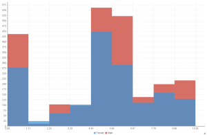
Horizontal Axis | Select the metric you wish to analyse the distribution of. |
Colour | Optional: You can select one field to split your values by colour. |
...
グラフデータオプション
オプション | 説明 |
|---|---|
横軸 | 分布を分析するメトリックを選択します。 |
色 | オプション:値を色別に分割するためのフィールドを1つ選択できます。 |
ヒストグラムチュートリアル
| Styleclass | ||
|---|---|---|
| ||
Summary
In order to set up a Histogram Chart you will need:
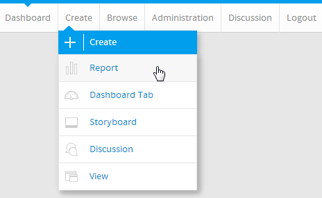
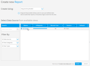
- Create a report with chart display
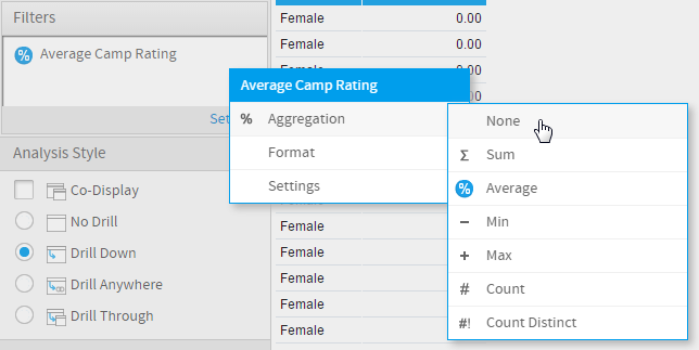
- Select a field to use as the Horizontal Axis
- Select a field to use as the Colour (optional field)
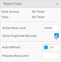
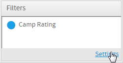
- Enable the display of duplicate records
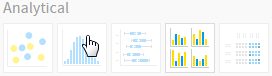
- Create your chart, selecting Histogram as the type under the Analytical heading
- Provide the Horizontal Axis and Colour options
- Customise the Chart as required
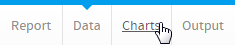
- Proceed to the Output step
- Save your report
...
サマリー
ヒストグラムグラフを設定するには、以下のステップを実行する必要があります。
- グラフ表示されるレポートを作成します。
- 横軸として使用するフィールドを選択します。
- 色として使用するフィールドを選択します(オプションフィールド)。
- 重複レコードの表示を有効にします。
- 「分析」の中にある「ヒストグラム」を選択してグラフを作成します。
- 「横軸」および「色」オプションを入力します。
- 必要に応じてグラフをカスタマイズします。
- 「表示」ステップに進みます。
- レポートを「保存」します。
チュートリアル
| Section | ||||||||||
|---|---|---|---|---|---|---|---|---|---|---|
|
| Section | ||||||||||
|---|---|---|---|---|---|---|---|---|---|---|
|
| Section | ||||||||||
|---|---|---|---|---|---|---|---|---|---|---|
|
| Section | ||||||||||
|---|---|---|---|---|---|---|---|---|---|---|
|
| Section | ||||||||||
|---|---|---|---|---|---|---|---|---|---|---|
|
| Section | ||||||||||
|---|---|---|---|---|---|---|---|---|---|---|
|
| Section | ||||||||||
|---|---|---|---|---|---|---|---|---|---|---|
|
| Section | ||||||||||
|---|---|---|---|---|---|---|---|---|---|---|
|
| horizontalrule |
|---|
| Styleclass | ||
|---|---|---|
| ||