Page History
...
| Table of Contents | ||
|---|---|---|
|
...
概要
| Styleclass | ||
|---|---|---|
| ||
タイプ Type | アイコン Icon | 主な用途 When to Use |
|---|---|---|
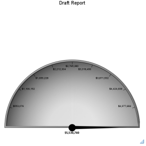
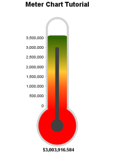
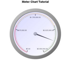
メーターグラフ Meter | | You want to measure the rate of change of a measure against pre-defined targets. Useful for dashboard reporting. |
Thermometer |
| Vertical representation of the meter chart, indicating a range of qualitative indicators. |
Dial |
| Used to communicate key performance indicators. |
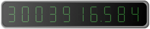
Numeric Display |
| Shows the value of a metric on a digital display. |


Chart Data Options
Option | Description |
|---|---|
Series | Typically a numeric value such as $. An item that you want to measure on your Chart |
あらかじめ設定された目標に対する達成率を表現できます。ダッシュボードで使うのが効果的です。 | ||
温度計 | | メーター図を縦に表現した図です。量・数値指標の範囲をわかりやすく示します。 |
ダイアル | | 業績評価指標(KPI)をモニターするために使用します。 |
数字表示 | | メトリック(数値)の値をデジタルで表示します。 |
グラフデータオプション
オプション | 説明 |
|---|---|
シリーズ | $などが代表的な数値型の値です。グラフ上で測定するアイテムです。 |
メーターグラフチュートリアル
...
| Styleclass | ||
|---|---|---|
| ||
Summary
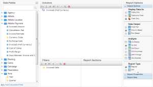
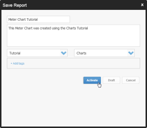
In order to set up a Meter Chart you will need:
- Create a report with chart display
- Select a field to use as the Metric
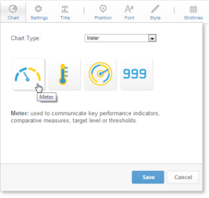
- Create your chart, selecting Meter as the type
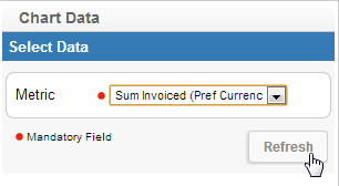
- Provide the Metric option and Refresh
- Customise the Chart as required
- Close the Chart Builder
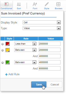
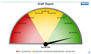
- Apply Conditional Formatting if the chart requires it
- Save your report
サマリー
メーターグラフを設定するには、以下の手順を実行する必要があります:
- グラフ表示されるレポートを作成します。
- 「メトリック」として使用するフィールドを選択します。
- タイプとして「メーターグラフ」を選択してグラフを作成します。
- 「メトリック」オプションを入力し、「更新」をクリックします。
- 必要に応じてグラフをカスタマイズします。
- 「閉じる」をクリックしてグラフビルダーを閉じます。
- グラフに必要な場合は、条件付き書式を適用します。
- レポートを「保存」します。
チュートリアル
...
| Section | ||||||||||
|---|---|---|---|---|---|---|---|---|---|---|
|


| Section | ||||||||||
|---|---|---|---|---|---|---|---|---|---|---|
|
| Section | ||||||||||
|---|---|---|---|---|---|---|---|---|---|---|
|
| Section | ||||||||||
|---|---|---|---|---|---|---|---|---|---|---|
|
| Section | ||||||||||
|---|---|---|---|---|---|---|---|---|---|---|
|

| Section | ||||||||||
|---|---|---|---|---|---|---|---|---|---|---|
|
| Section | ||||||||||
|---|---|---|---|---|---|---|---|---|---|---|
|
| Section | ||||||||||
|---|---|---|---|---|---|---|---|---|---|---|
|
| Section | ||||||||||
|---|---|---|---|---|---|---|---|---|---|---|
|
| Section | |||||
|---|---|---|---|---|---|
|
| Section | |||||
|---|---|---|---|---|---|
|
| horizontalrule |
|---|
| Styleclass | ||
|---|---|---|
| ||