Page History
| Anchor | ||||
|---|---|---|---|---|
|
...
| Table of Contents | ||
|---|---|---|
|
概要
| Styleclass | ||
|---|---|---|
| ||
このページでは、管理者は、以下のタブに分類されるコンテンツについて、幅広いデフォルト設定および書式設定を行うことができます:This page allows administrators to configure a wide range of defaults and formatting settings for content that fall under the following tabs:
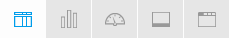
- #Report Settings#レポート設定#Chart Settings
- #グラフの設定
- #Dashboard Settings#ダッシュボード設定#Storyboard Settings
- #ストーリーボード設定
- #Browse Settings#閲覧の設定
...
レポート設定
| Styleclass | ||
|---|---|---|
| ||

| Expand | |
|---|---|
|
...
|
...
|
...
|
...
|
...
Title
...
Define the font formatting to be applied to the Report Title.
...
Description
...
Define the font formatting to be applied to the Report Description.
...
Border
...
Define a border for the Report Title & Description if one is required.
...
Background
...
Define a custom background colour for the Report Title & Description area if required.
...
Column & Row Headings
...
...
Text
...
Define the font formatting to be applied to table Column and Row headings.
...
Background
...
Define the background colour to be applied to table Column and Row headings.
...
Header Height
...
Define the height of the table headers in pixels.
...
Header Padding
...
Define the space between the text in each header cell and the cell border in pixels.
...
Data
...
...
Text
...
Define the font formatting to be applied to table cells.
...
Cell Height
...
Define the height of the table rows in pixels.
...
Cell Padding
...
Define the space between the text in each cell and the cell border in pixels.
...
Cell Spacing
...
Define the space between each cell in pixels.
...
Row Shading
...
Define an alternate row shading colour for the body of tabular reports.
...
Row Highlight
...
Define a highlight colour displayed when the mouse pointer hovers over a row.
...
Section Title
...
...
Text
...
Define the font formatting to be applied to Report Section titles.
...
Background
...
Define a background colour for Report Section titles.
...
Header & Footer
...
...
Header
...
Define the contents of the left, middle, and right page header areas used in report exports. The following components are available:
- Date: this will insert the current date into the header when the report is exported, printed, or shared.
- Page No: this will insert a page number on each page of the report when it's exported, printed, or shared.
- Description: this will insert the report description into the header when the report is exported, printed, or shared.
- Title: this will insert the report title into the header when the report is exported, printed, or shared.
- Time: this will insert the current time into the header when the report is exported, printed, or shared.
- Space: this will insert a space into the header, for use between two components, for example: date space time.
- New Line: this will insert a line break into the header, for use between components, for example: title new line description.
- Text: this will allow the administrator to provide custom text to be used in the header.
- Image: this will allow the administrator to select an image to use in the header, such as a logo.
...
Footer
...
Define the contents of the left, middle, and right page footer areas used in report exports. The following components are available:
- Date: this will insert the current date into the footer when the report is exported, printed, or shared.
- Page No: this will insert a page number on each page of the report when it's exported, printed, or shared.
- Description: this will insert the report description into the footer when the report is exported, printed, or shared.
- Title: this will insert the report title into the footer when the report is exported, printed, or shared.
- Time: this will insert the current time into the footer when the report is exported, printed, or shared.
- Space: this will insert a space into the footer, for use between two components, for example: date space time.
- New Line: this will insert a line break into the footer, for use between components, for example: title new line description.
- Text: this will allow the administrator to provide custom text to be used in the footer.
- Image: this will allow the administrator to select an image to use in the footer, such as a logo.
...
Text
...
Define the font formatting to be applied to header and footer text used in report exports.
...
Report Summary
...
...
Text
...
Define the font formatting to be applied to Report Summary text.
...
Default Chart Colour
...
Specify the default chart colour to be used in Report Summary charts.
| Expand | ||||||||
|---|---|---|---|---|---|---|---|---|
| ||||||||
|
| Expand | ||||||||
|---|---|---|---|---|---|---|---|---|
| ||||||||
|
| Expand | ||||||
|---|---|---|---|---|---|---|
| ||||||
|
Chart Settings
| Styleclass | ||
|---|---|---|
| ||

| Expand | ||||||
|---|---|---|---|---|---|---|
| ||||||
|
| Expand | ||||||||
|---|---|---|---|---|---|---|---|---|
| ||||||||
|
| Expand | ||||||||||||||||
|---|---|---|---|---|---|---|---|---|---|---|---|---|---|---|---|---|
| ||||||||||||||||
|
| Expand | ||||||||||||||||
|---|---|---|---|---|---|---|---|---|---|---|---|---|---|---|---|---|
| ||||||||||||||||
|
| Expand | ||||||
|---|---|---|---|---|---|---|
| ||||||
|
| Expand | ||||||||||||||
|---|---|---|---|---|---|---|---|---|---|---|---|---|---|---|
| ||||||||||||||
|
| Expand | ||||||||||
|---|---|---|---|---|---|---|---|---|---|---|
| ||||||||||
|
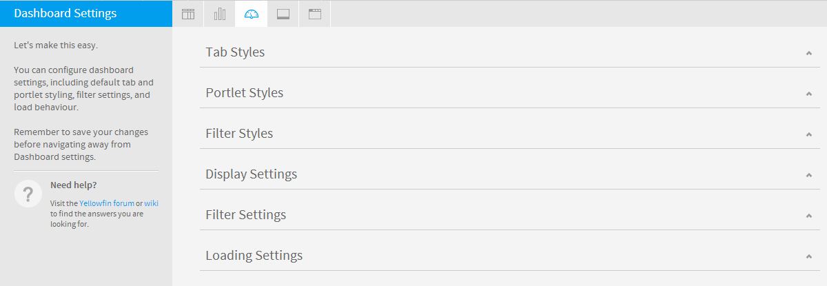
Dashboard Settings
| Styleclass | ||
|---|---|---|
| ||
...
| title | Tab Styles |
|---|
...
Option
...
Description
...
Content Area Background
...
Define the colour to be used for the tab body. This will be displayed around the portlet areas on the tab.
...
Top Margin
...
Define the top margin height and colour. This is the spacing above the tab images on the dashboard and below the main navigation bar.
|
| Expand | ||||||||
|---|---|---|---|---|---|---|---|---|
| ||||||||
|
| Expand | ||||||||
|---|---|---|---|---|---|---|---|---|
| ||||||||
|
| Expand | ||||||
|---|---|---|---|---|---|---|
| ||||||
|
グラフの設定
| Styleclass | ||
|---|---|---|
| ||
| Expand | ||||||
|---|---|---|---|---|---|---|
| ||||||
|
| Expand | ||||||||
|---|---|---|---|---|---|---|---|---|
| ||||||||
|
| Expand | ||||||||||||||||
|---|---|---|---|---|---|---|---|---|---|---|---|---|---|---|---|---|
| ||||||||||||||||
|
| Expand | ||||||||||||||||
|---|---|---|---|---|---|---|---|---|---|---|---|---|---|---|---|---|
| ||||||||||||||||
|
| Expand | ||||||
|---|---|---|---|---|---|---|
| ||||||
|
| Expand | ||||||||||||||
|---|---|---|---|---|---|---|---|---|---|---|---|---|---|---|
| ||||||||||||||
|
| Expand | ||||||||||
|---|---|---|---|---|---|---|---|---|---|---|
| ||||||||||
|
ダッシュボード設定
| Styleclass | ||
|---|---|---|
| ||
| Expand | |||||||
|---|---|---|---|---|---|---|---|
| |||||||
|
...
|
...
Image Height
...
Define the height of the tab images.
...
Divider
...
Define the colour to be used as a horizontal divider between the tab images area and the main body of the tab.
...
Bottom Margin
...
Define the height of the bottom margin. This is the spacing between the tab images and the sub tabs, or the top portlets on a tab.
...
Sub Tab Height
...
Define the height of the sub tab area. This is the space below the bottom margin and above the top portlets on a tab.
|
...
Sub Tab Divider
...
| Expand | |
|---|---|
|
...
|
...
|
...
|
...
Border
...
Define a colour to be used as a border for each portlet area.
...
Background
...
Define a colour to be used as the background for each portlet area.
...
Title
...
Define the font formatting to be applied to portlet Title text.
...
Title Background Image
...
Hide the tab images behind the Title text of each portlet area. This will mean that the background colour is shown instead.
...
Title Background Colour
...
Define the background colour of the portlet Title area. This will be displayed when the Title Background Images are disabled.
|
...
Action Buttons
...
| Expand | |
|---|---|
|
...
|
...
|
...
|
...
Panel Background
...
Define a colour to be used as the background for the filter panel area. This is not used if filters are displayed through the Left Navigation Panel.
...
Title
...
Define the font formatting to be applied to the filter Titles. This is not used if filters are displayed through the Left Navigation Panel.
...
Group Background
...
Define a colour to be used as the background for filter groups. This is not used if filters are displayed through the Left Navigation Panel.
|
...
Group Title
...
| Expand | |
|---|---|
|
...
|
...
|
...
|
...
Default Dashboard Width
...
Define the default width of the dashboard in pixels or % of the current window.
...
Alignment
...
Specify the default alignment of the dashboard.
...
Tab Buttons
...
Specify the location of the dashboard tab buttons, or disable them completely. These are the Add Tab, Edit, and Remove buttons.
...
My Content Location
...
Specify the location of the My Content panel, or disable it completely. This contains Favourite, Draft, and Recently Accessed content lists.
...
Associated Reports Location
...
Specify the location of the Associated Reports panel, or disable it completely.
|
...
Search Location
...
| Expand | |
|---|---|
|
...
|
...
|
...
|
...
Filter Location
...
Specify the default location of the filter panel on the Dashboard. This can be overridden on a tab by tab basis.
...
Apply Style
|
...
| Expand | |
|---|---|
|
...
|
...
|
...
|
...
Page Refresh
...
Each time the user changes the tab they are viewing, only the items relevant to the tab are reloaded, such as reports, filters, units, etc. This is only compatible with browsers that support HTML5.
...
Refresh Overlay
...
Displays a coloured overlay on the tab while it loads to indicate it is refreshing.
...
Loading Indicator
...
Displays a loading indicator for the tab.
...
Report Loading
...
Load all the reports on a tab at the same time or sequentially.
|
ストーリーボード設定
...
| Styleclass | ||
|---|---|---|
| ||
| Expand | |
|---|---|
|
...
|
...
|
...
|
...
Slides Preloaded
...
Define the number of slides to be preloaded either side of the current slide.
...
Slides Loaded at Once
...
Define the total number of slides to be loaded at any one time.
|
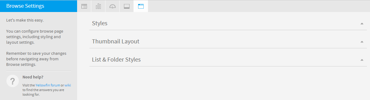
閲覧の設定
...
| Styleclass | ||
|---|---|---|
| ||
| Expand | |
|---|---|
|
...
|
...
|
...
|
...
Background Colour
...
Define a colour to be used as the background for the browse page. This applies to all layout options.
...
Search Bar Colour
...
Define a colour to be used as the background of the search bar. This applies to all layout options.
...
Search Bar Height
...
Define the height of the search bar. This applies to all layout options.
|
...
Search Bar Bottom Border
...
| Expand | |
|---|---|
|
...
|
...
|
...
|
...
Alignment
...
Specify the default alignment of the thumbnail tiles on the browse page.
...
Columns
...
|
| Expand | |
|---|---|
|
...
Option
...
Description
...
Alternate Row
...
Define a colour to be used for every second row displayed in the Browse list.
...
Hover
...
Define a colour to be used to highlight a row the mouse is hovered over in the Browse list.
| ||||||||
|
...
Selected
...
| horizontalrule |
|---|
| Styleclass | ||
|---|---|---|
| ||