Page History
...
| Table of Contents | ||
|---|---|---|
|
...
概要
| Styleclass | ||
|---|---|---|
| ||
In the chart data panel you will be prompted to select the series you wish to use in your chart and also edit the series style options. Having selected your chart type, the data selection panel will be refreshed to display the appropriate options for the chart.
...
グラフデータパネルでは、グラフで使用するシリーズの選択肢が表示され、またシリーズのスタイルを編集するオプションも表示されます。グラフのタイプを選択すると、データの選択パネルが更新されてグラフに適したオプションが表示されます。
標準要素
| Styleclass | ||
|---|---|---|
| ||
Icon アイコン | Component 要素 | Description 説明 |
|---|---|---|
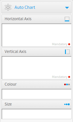
| 横軸 | グラフの横軸を定義するために使用するフィールド。選択したグラフのタイプに応じて、ディメンション(次元)フィールドまたはメトリック(数値)フィールドのいずれかです。Horizontal Axis |
| 縦軸 | グラフの縦軸を定義するために使用するフィールド。選択したグラフのタイプに応じて、ディメンション(次元)フィールドまたはメトリック(数値)フィールドのいずれかです。Vertical Axis |
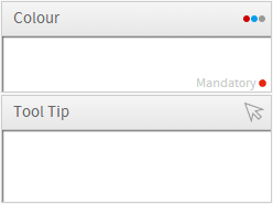
| 色 | グラフで使用される色を定義するために使用するフィールド。選択したグラフのタイプに応じて、ディメンション(次元)フィールドまたはメトリック(数値)フィールドのいずれかです。Colour |
| サイズ | グラフ内のバブルのサイズを指定するために使用するフィールド。メトリック(数値)フィールドまたは要約ディメンション(次元)フィールドです。Size |
| Animation |
...
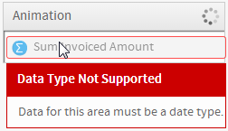
アニメーション | グラフをアニメートするためのフレームとして使用できる、日付フィールドまたは時間フィールド。アニメーションフィールドのそれぞれの値によって、アニメーションのユニークなフレームが生成されます。 |
特殊要素
| Styleclass | ||
|---|---|---|
| ||
Icon アイコン | Component 要素 | Description 説明 | ||
|---|---|---|---|---|
| イメージ | データの表示に使用するイメージを選択します。ラスタマップ、比較インフォグラフィック、および比例インフォグラフィックで使用します。 | ||
| 地域 | 地域はフィールドで、マップの領域に関連する参照コードがあります。ラスタマップで使用します。 | Image | Used for Raster Maps, Comparative Infographics, and Proportional Infographics |
| Label | ラベル | ロールオーバー(マウスカーソルの移動に従って画像が変わる)バブルのラベル。Googleマップで使用します。Used for Google, | |
| Description | 説明 | ロールオーバー(マウスカーソルの移動に従って画像が変わる)バブル内の説明。Googleマップで使用します。Used for Google, | |
| Link | リンク | 外部のサイトやレポートに移動させるためのバブルに組み込めるハイパーリンク。Googleマップで使用します。Used for Google, | |
| Latitude | 緯度 | 緯度座標のフィールド。Googleマップで使用します。Used for Google, | |
| Longitude | 経度 | 経度座標のフィールド。Googleマップで使用します。Used for Google, | |
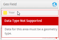
| Geo Field | ジオフィールド | GISデータ型を含むレポート内のフィールド。Google GISマップ、GISマップ、GISバブルマップ、GISヒートマップで使用します。Used for Google GIS Maps, GIS Maps, GIS Bubble Maps, GIS Heat Maps, | |
| Tool Tip | ツールチップ | ツールチップのテキストに使用されるフィールド。Google GISマップ、GISマップ、GISバブルマップで使用します。 for Google GIS Maps, GIS Maps, GIS Bubble Maps, | |
| Measureメトリック(数値) | メーターグラフは1つの値だけを表示するため、この1つの値に使用するシリーズを選択します。メーターグラフで使用します。Used for Meters | ||
| Radarレーダーグラフ | レーダーのスポークに使用されるカテゴリーフィールド。レーダーグラフで使用します。Used for Radars | ||
| Eventsイベント for Events | 各時間の値でイベントが発生していたかどうかを示すバイナリー値。イベントグラフで使用します。 | ||
| Value値 | グラフにトレンドラインを表示するためにユーザーが作成したメトリック(数値)。フィナンシャル・線グラフおよびイベントグラフで使用します。 for Financial Lines | ||
| Volume | ボリューム | 期間内に取引された株数。フィナンシャル・線グラフ、ハイロウグラフ、ロウソクグラフで使用します。 for Financial Lines, High Low, Candlestick | |
| Trend | 傾向 | グラフにトレンドラインを表示するためにユーザーが作成したメトリック(数値)。フィナンシャル・線グラフ、ハイロウグラフ、ロウソクグラフで使用します。Used for Financial Lines, High Low, Candlestick | |
| Start | 開始 | 期間(通常:日)の開始時点の株価。ハイロウグラフ、ロウソクグラフで使用します。Used for High Low, Candlestick | |
| End | 終了 | 期間(通常:日)の終了時点の株価。ハイロウグラフ、ロウソクグラフで使用します。Used for High Low, Candlestick | |
| High | 高 | 期間内に到達した最高株価。ハイロウグラフ、ロウソクグラフで使用します。Used for High Low, Candlestick | |
| Low | Used for High Low, Candlestick |
| Expand | ||||||||
|---|---|---|---|---|---|---|---|---|
| ||||||||
|
| Expand | ||||||||||||||||
|---|---|---|---|---|---|---|---|---|---|---|---|---|---|---|---|---|
| ||||||||||||||||
|
| Expand | ||||||||||
|---|---|---|---|---|---|---|---|---|---|---|
| ||||||||||
|
| Expand | ||||
|---|---|---|---|---|
| ||||
|
| Expand | ||||||||||
|---|---|---|---|---|---|---|---|---|---|---|
| ||||||||||
|
| Expand | ||||||||||||
|---|---|---|---|---|---|---|---|---|---|---|---|---|
| ||||||||||||
|
| Expand | ||||||
|---|---|---|---|---|---|---|
| ||||||
|
| Expand | ||||||||
|---|---|---|---|---|---|---|---|---|
| ||||||||
|
Animation
Charts that are built with a date or datetime field available will have an Animation option displayed in the Chart Data area.
Animation uses a date field to slice up the chart into frames, much like a section slices up a table into sub tables. Simply select the date field, such as Year, as the animation field and Yellowfin will create a frame per year value. When you return to the report preview page you will be able to play the animation or step through using the navigation buttons.
It is also recommended that you change the Chart Title option to display the Animation Field, rather than the Report Name, in order to provide the report writer with a label for each frame.
Note: The animation option will only be available if a date field has been used in the report. It's also important to remember to use a date field that won't create too many frames, as animation is meant for high level data, like year rather than day.
低 | 期間内に到達した最低株価。ハイロウグラフ、ロウソクグラフで使用します。 |
テスト
| Styleclass | ||
|---|---|---|
| ||
グラフ作成プロセスで正しいフィールドを使用できるようにするために、確認メッセージがユーザーに表示されます。
必須フィールドとオプションフィールド
選択されたグラフのタイプについて、どのフィールドが必須でどのフィールドがオプションかをユーザーに知らせるために、必須要素の要素領域に 赤い丸が表示されます。
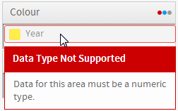
コンポーネントの検証
ユーザーが正しくグラフ要素領域にデータを投入できるようにするために、間違ったタイプのフィールドが要素にドラッグされると確認メッセージが表示されます。
日付タイプ | ジオメトリタイプ | 数値タイプ |
|---|---|---|
| | |
| horizontalrule |
|---|
| Styleclass | ||
|---|---|---|
| ||