Page History
| Anchor | ||||
|---|---|---|---|---|
|
| Table of Contents | ||
|---|---|---|
|
...
概要
| Styleclass | ||
|---|---|---|
|
...
- #Report Settingsレポート設定#Chart Settings
- グラフの設定
- #Dashboard Settingsダッシュボード設定#Storyboard Settings
- ストーリーボード設定
- #Browse Settings閲覧の設定
...
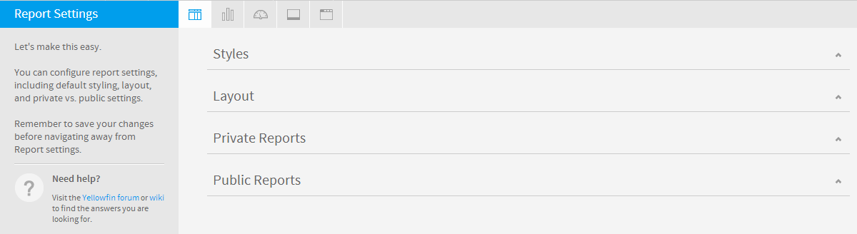
レポート設定
| Styleclass | ||
|---|---|---|
|
...
| Expand | |
|---|---|
|
...
|
...
|
...
|
...
|
...
Title
...
Define the font formatting to be applied to the Report Title.
...
Description
...
Define the font formatting to be applied to the Report Description.
...
Border
...
Define a border for the Report Title & Description if one is required.
...
Background
...
Define a custom background colour for the Report Title & Description area if required.
...
Column & Row Headings
...
...
Text
...
Define the font formatting to be applied to table Column and Row headings.
...
Background
...
Define the background colour to be applied to table Column and Row headings.
...
Header Height
...
Define the height of the table headers in pixels.
...
Header Padding
...
Define the space between the text in each header cell and the cell border in pixels.
...
Data
...
...
Text
...
Define the font formatting to be applied to table cells.
...
Cell Height
...
Define the height of the table rows in pixels.
...
Cell Padding
...
Define the space between the text in each cell and the cell border in pixels.
...
Cell Spacing
...
Define the space between each cell in pixels.
...
Row Shading
...
Define an alternate row shading colour for the body of tabular reports.
...
Row Highlight
...
Define a highlight colour displayed when the mouse pointer hovers over a row.
...
Section Title
...
...
Text
...
Define the font formatting to be applied to Report Section titles.
...
Background
...
Define a background colour for Report Section titles.
...
Header & Footer
...
...
Header
...
Define the contents of the left, middle, and right page header areas used in report exports. The following components are available:
- Date: this will insert the current date into the header when the report is exported, printed, or shared.
- Page No: this will insert a page number on each page of the report when it's exported, printed, or shared.
- Description: this will insert the report description into the header when the report is exported, printed, or shared.
- Title: this will insert the report title into the header when the report is exported, printed, or shared.
- Time: this will insert the current time into the header when the report is exported, printed, or shared.
- Space: this will insert a space into the header, for use between two components, for example: date space time.
- New Line: this will insert a line break into the header, for use between components, for example: title new line description.
- Text: this will allow the administrator to provide custom text to be used in the header.
- Image: this will allow the administrator to select an image to use in the header, such as a logo.
...
Footer
...
Define the contents of the left, middle, and right page footer areas used in report exports. The following components are available:
- Date: this will insert the current date into the footer when the report is exported, printed, or shared.
- Page No: this will insert a page number on each page of the report when it's exported, printed, or shared.
- Description: this will insert the report description into the footer when the report is exported, printed, or shared.
- Title: this will insert the report title into the footer when the report is exported, printed, or shared.
- Time: this will insert the current time into the footer when the report is exported, printed, or shared.
- Space: this will insert a space into the footer, for use between two components, for example: date space time.
- New Line: this will insert a line break into the footer, for use between components, for example: title new line description.
- Text: this will allow the administrator to provide custom text to be used in the footer.
- Image: this will allow the administrator to select an image to use in the footer, such as a logo.
...
Text
...
Define the font formatting to be applied to header and footer text used in report exports.
...
Report Summary
...
...
Text
...
Define the font formatting to be applied to Report Summary text.
...
Default Chart Colour
...
Specify the default chart colour to be used in Report Summary charts.
|
| Expand | ||||||||
|---|---|---|---|---|---|---|---|---|
| ||||||||
|
| Expand | ||||||||
|---|---|---|---|---|---|---|---|---|
| ||||||||
|
| Expand | ||||||
|---|---|---|---|---|---|---|
| ||||||
|
| Expand | ||||||||||
|---|---|---|---|---|---|---|---|---|---|---|
| ||||||||||
|
グラフの設定
| Styleclass | ||
|---|---|---|
| ||

| Expand | ||||||
|---|---|---|---|---|---|---|
| ||||||
|
| Expand | ||||||||
|---|---|---|---|---|---|---|---|---|
| ||||||||
|
| Expand | ||||||||||||||||
|---|---|---|---|---|---|---|---|---|---|---|---|---|---|---|---|---|
| ||||||||||||||||
|
| Expand | ||||||||||||||||
|---|---|---|---|---|---|---|---|---|---|---|---|---|---|---|---|---|
| ||||||||||||||||
|
| Expand | ||||||
|---|---|---|---|---|---|---|
| ||||||
|
| Expand | ||||||||||||||
|---|---|---|---|---|---|---|---|---|---|---|---|---|---|---|
| ||||||||||||||
|
| Expand | ||||||||||||
|---|---|---|---|---|---|---|---|---|---|---|---|---|
| ||||||||||||
|
| Expand | ||||||||||||||||||
|---|---|---|---|---|---|---|---|---|---|---|---|---|---|---|---|---|---|---|
| ||||||||||||||||||
|
ダッシュボード設定
| Styleclass | ||
|---|---|---|
| ||

| Expand | ||||||||||||||||||
|---|---|---|---|---|---|---|---|---|---|---|---|---|---|---|---|---|---|---|
| ||||||||||||||||||
|
| Expand | ||||||||||||||
|---|---|---|---|---|---|---|---|---|---|---|---|---|---|---|
| ||||||||||||||
|
| Expand | ||||||||||
|---|---|---|---|---|---|---|---|---|---|---|
| ||||||||||
|
| Expand | ||||||||||||||||
|---|---|---|---|---|---|---|---|---|---|---|---|---|---|---|---|---|
| ||||||||||||||||
|
| Expand | ||||||
|---|---|---|---|---|---|---|
| ||||||
|
| Expand | ||||||||||||||
|---|---|---|---|---|---|---|---|---|---|---|---|---|---|---|
| ||||||||||||||
|
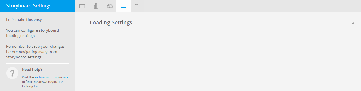
ストーリーボード設定
| Styleclass | ||
|---|---|---|
| ||
| Expand | ||||||
|---|---|---|---|---|---|---|
| ||||||
|
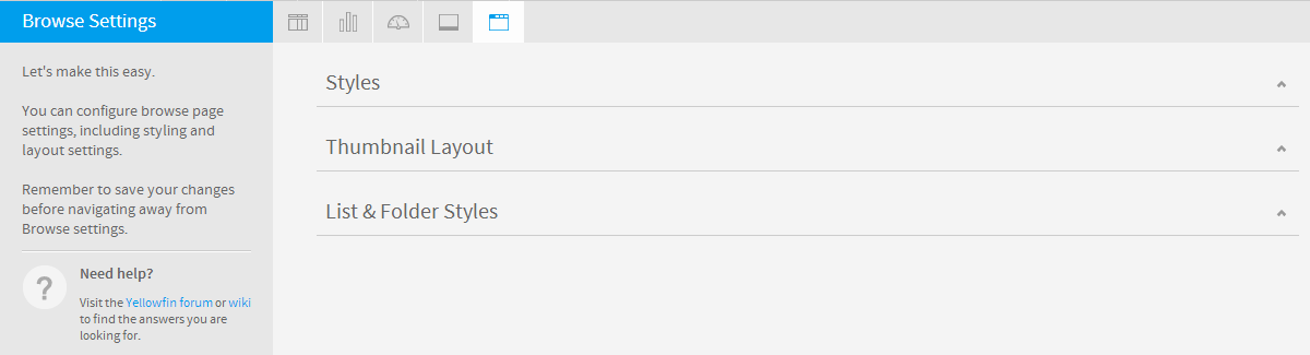
閲覧の設定
| Styleclass | ||
|---|---|---|
| ||
| Expand | ||||||||||
|---|---|---|---|---|---|---|---|---|---|---|
| ||||||||||
|
| Expand | ||||||
|---|---|---|---|---|---|---|
| ||||||
|
| Expand | ||||||||
|---|---|---|---|---|---|---|---|---|
| ||||||||
|
| horizontalrule |
|---|
| Styleclass | ||
|---|---|---|
| ||
| Expand | ||||||||
|---|---|---|---|---|---|---|---|---|
| ||||||||
|
| Expand | ||||||||
|---|---|---|---|---|---|---|---|---|
| ||||||||
|
| Expand | ||||||
|---|---|---|---|---|---|---|
| ||||||
|
Chart Settings
| Styleclass | ||
|---|---|---|
| ||
| Expand | ||||||
|---|---|---|---|---|---|---|
| ||||||
|
| Expand | ||||||||
|---|---|---|---|---|---|---|---|---|
| ||||||||
|
| Expand | ||||||||||||||||
|---|---|---|---|---|---|---|---|---|---|---|---|---|---|---|---|---|
| ||||||||||||||||
|
| Expand | ||||||||||||||||
|---|---|---|---|---|---|---|---|---|---|---|---|---|---|---|---|---|
| ||||||||||||||||
|
| Expand | ||||||
|---|---|---|---|---|---|---|
| ||||||
|
| Expand | ||||||||||||||
|---|---|---|---|---|---|---|---|---|---|---|---|---|---|---|
| ||||||||||||||
|
| Expand | ||||||||||||
|---|---|---|---|---|---|---|---|---|---|---|---|---|
| ||||||||||||
|
| Expand | ||||||||||||||||||
|---|---|---|---|---|---|---|---|---|---|---|---|---|---|---|---|---|---|---|
| ||||||||||||||||||
|
Dashboard Settings
| Styleclass | ||
|---|---|---|
| ||
| Expand | ||||||||||||||||||
|---|---|---|---|---|---|---|---|---|---|---|---|---|---|---|---|---|---|---|
| ||||||||||||||||||
|
| Expand | ||||||||||||||
|---|---|---|---|---|---|---|---|---|---|---|---|---|---|---|
| ||||||||||||||
|
| Expand | ||||||||||
|---|---|---|---|---|---|---|---|---|---|---|
| ||||||||||
|
| Expand | ||||||||||||||||
|---|---|---|---|---|---|---|---|---|---|---|---|---|---|---|---|---|
| ||||||||||||||||
|
| Expand | ||||||
|---|---|---|---|---|---|---|
| ||||||
|
| Expand | ||||||||||
|---|---|---|---|---|---|---|---|---|---|---|
| ||||||||||
|
Storyboard Settings
| Styleclass | ||
|---|---|---|
| ||
| Expand | ||||||
|---|---|---|---|---|---|---|
| ||||||
|
Browse Settings
| Styleclass | ||
|---|---|---|
| ||
| Expand | ||||||||||
|---|---|---|---|---|---|---|---|---|---|---|
| ||||||||||
|
| Expand | ||||||
|---|---|---|---|---|---|---|
| ||||||
|
| Expand | ||||||||
|---|---|---|---|---|---|---|---|---|
| ||||||||
|
| horizontalrule |
|---|
...
| Class | topLink |
|---|
...