Page History
...
| Table of Contents | ||
|---|---|---|
|
...
概要
| Styleclass | ||
|---|---|---|
| ||
グラフを作成する最初のステップは、適切なグラフのタイプを選択してデータをより効果的に視覚化することです。グラフの作成方法には、以下の2種類があります。
- おまかせグラフ
- グラフの選択
おまかせグラフ
| Styleclass | ||
|---|---|---|
| ||
おまかせグラフ機能では、データを投入する一般的な要素領域が示され、それらの領域にドラッグしたフィールドに応じてグラフが生成されます。
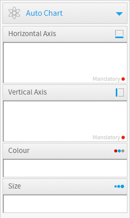
注意:おまかせグラフでは、棒グラフやカラムグラフ、散布図、線グラフといった、一般的なタイプのグラフが生成されます。特定のグラフまたは特殊グラフが必要な場合は、右側の「グラフの選択」パネルからタイプを選択する方が適しています。
グラフの選択
| Styleclass | ||
|---|---|---|
| ||
The first step in creating your chart is selecting the appropriate chart type to most effectively visualise your data. The following table of chart choices will assist you to make you selection.
One of the features of Yellowfin is that even after you have made a selection it is easy to swap between chart types to see how your data might look with different visualisations.
選択できるグラフのタイプは以下のとおりです。タイプを選択したあとで、簡単にグラフのタイプを替えて、データを違うタイプのグラフで表示して確認できます。
| Section | |||||||||
|---|---|---|---|---|---|---|---|---|---|
|
...
|
...
|
...
|
...
|
...
|

...
Scatter
...
|

...
Histogram
...
|

...
Box & Whisker
|
...
|

...
Trellis
...
|

...
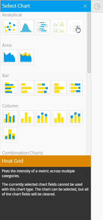
Heat Grid
...
Plots the intensity of a metric across multiple categories.
|
...
|
...
|
...
|
...
|
...
|

...
Area
...
|
...
|

...
Stacked Area
...
You want to emphasise the magnitude of change over time, while comparing multiple categories.
|
...
|
...
|
...
|
...
|
...
|

...
Horizontal Bar
...
|

...
3D Horizontal Bar
|
...
|

...
Stacked Horizontal Bar
|
...
|

...
Horizontal Cylinder
|
...
|

...
Proportional Bar
...
Displays how close values in different categories came to the highest category value.
|
...
|
...
|
...
|
...
|
...
|

...
Vertical Column
...
|

...
3D Vertical Bar
|
...
|

...
Stacked Vertical Bar
|
...
|

...
Cylinder
|
...
|

...
3D Stacked Vertical Bar
|
...
|

...
Layered
...
Compares the contribution of each value to a total across categories.
|
...
|
...
|
...
|
...
|
...
|

...
Combination Charts
...
|

...
Overlay Chart
...
Use the line chart to emphasize a trend and bars to emphasize specific values. Line/Bar combinations may work better by de-emphasizing bars through the use of subtle colours.
|
...
|
...
|
...
|
...
|
...
|

...
Financial Line
|
...
|

...
High Low
...
|

...
Candlestick
...
Shows daily high, low, opening and closing values with different colour bars depending on the daily direction.
|
...
|
...
|
...
|
...
|
...
|

...
Line
...
|

...
3D Line
|
...
|

...
Z Chart
...
|

...
Stepped Line
...
A line chart where movement is shown in steps rather than straight lines.
|
...
|
...
|
...
|
...
|
...
|

...
Image Maps
...
If you do not have GIS defined columns you can use the Image Maps to create heat maps - these are a good way to display metrics with a spatial element such as Revenue by State or Country
You will only be able to render maps for which an image map has been defined.
|


グラフセレクターガイド
| Styleclass | ||
|---|---|---|
| ||
...

...
Google Maps
...
Google Maps allow you to render location data points onto a Google map which will be displayed as a Yellowfin Chart - along with associated Google map widgets.
...

...
GIS Google Maps
...
A Google map which uses GIS data for its marker coordinates.
...

...
GIS Maps
...
GIS Maps allow the rendering of complex GIS polygons. These can be used to render spatial reports on the fly based on the GIS data available in a report.
...

...
GIS Bubble Map
...
A bubble map in which bubble positions are specified by GIS points.
...

...
GIS Heat Map
...
A heat map where colours representing GIS points are blended based on intensity.
See Maps for more information.
| Expand | |||||||||||||||
|---|---|---|---|---|---|---|---|---|---|---|---|---|---|---|---|
| |||||||||||||||
|
| Expand | |||||||||||||||
|---|---|---|---|---|---|---|---|---|---|---|---|---|---|---|---|
| |||||||||||||||
|
| Expand | ||||||||||||||||||||||||
|---|---|---|---|---|---|---|---|---|---|---|---|---|---|---|---|---|---|---|---|---|---|---|---|---|
| ||||||||||||||||||||||||
|
Chart Selector
| Styleclass | ||
|---|---|---|
| ||

| horizontalrule |
|---|
| Styleclass | ||
|---|---|---|
| ||