30日間の無料評価版をお試しいただけます。

Versions Compared

Key

  • This line was added.
  • This line was removed.
  • Formatting was changed.
Comment: Migration of unmigrated content due to installation of a new plugin

...

Table of Contents
classcontents

...

概要

Styleclass
ClasstopLink

ページトップ

グラフを作成する最初のステップは、適切なグラフのタイプを選択してデータをより効果的に視覚化することです。グラフの作成方法には、以下の2種類があります。

  1. おまかせグラフ
  2. グラフの選択

おまかせグラフ

Styleclass
ClasstopLink

ページトップ

おまかせグラフ機能では、データを投入する一般的な要素領域が示され、それらの領域にドラッグしたフィールドに応じてグラフが生成されます。

Image Added

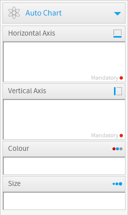
注意:おまかせグラフでは、棒グラフやカラムグラフ、散布図、線グラフといった、一般的なタイプのグラフが生成されます。特定のグラフまたは特殊グラフが必要な場合は、右側の「グラフの選択」パネルからタイプを選択する方が適しています。
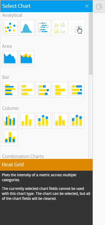
グラフの選択

Styleclass
ClasstopLink

top

The first step in creating your chart is selecting the appropriate chart type to most effectively visualise your data. The following table of chart choices will assist you to make you selection.

One of the features of Yellowfin is that even after you have made a selection it is easy to swap between chart types to see how your data might look with different visualisations.

ページトップ

選択できるグラフのタイプは以下のとおりです。タイプを選択したあとで、簡単にグラフのタイプを替えて、データを違うタイプのグラフで表示して確認できます。

Section
Column
width20%

Image Added

Column
width80%

...

Expand
title

...

分析

...

アイコン

...

Icon

...

When to Use

...

Scatter

...

Image Removed

...

A scatter plot (points not joined) chart that allows the charting of 2 related attribute series. Can only be used if the data series are related. Useful for seeing trends in data that is not linear.

...

Histogram

...

Image Removed

...

Shows the number of times a given value occurs in the dataset.

...

Box & Whisker

...

Image Removed

...

A chart which gives a quick overview of series of values and their statistical properties.

...

Trellis

...

Image Removed

...

A segmented chart for which the behaviour is determined by the data selected.

...

Heat Grid

...

Image Removed

...

Plots the intensity of a metric across multiple categories.

タイプ

主な用途

Image Added

散布図

互いに交わらない点を描画して、関連する2つの要素を図示するのに使います。線形でないデータの傾向を探るのに適しています。

Image Added

ヒストグラム

与えられた値のデータセット中での度数分布を表します。

Image Added

箱ひげ

シリーズの値やそれらの統計的属性を素早く把握できます。

Image Added

格子グラフ

グラフを指定したカテゴリーで分割します。

Image Added

ヒートグリッド

複数のカテゴリーを対象にメトリックの強度を描画します。

詳細については、分析グラフ を参照してください。

Expand
titleエリアグラフ

アイコン

タイプ

主な用途

Image Added

エリアグラフ

時間の経過による値の変化の大きさを強調する場合に適しています。時間の経過とともに値がどれくらい変化するのかを見るときに使用します。

Image Added

積み上げエリアグラフ

複数のカテゴリーを比較しながら時間の経過による値の変化の大きさを強調する場合に適しています。

詳細については、 エリアグラフ を参照してください。

Expand
title棒グラフ

アイコン

タイプ

主な用途

Image Added

横棒グラフ

データを縦に並べ、横の長さによってその比較を行います。時間の経過よりも値の比較に重きを置く場合に適しています。

Image Added

3D横棒グラフ

横棒グラフと似ていますが、3次元で表示されます。

Image Added

積み上げ横棒グラフ

カテゴリー別にデータをグループ化したり重ねたりして比較できます。全体に占める割合の比較を行いたいときに適しています。

Image Added

横棒シリンダーグラフ

横棒グラフと似ていますが、グラフ要素が円柱で表示されます。

Image Added

比例棒グラフ

異なるカテゴリーの値がそのカテゴリー内での最大値にどれだけ近いかを表します。

詳細については、 棒グラフ を参照してください。

Expand
titleカラムグラフ

アイコン

タイプ

主な用途

Image Added

縦棒グラフ

数値を横に並べ、高さによってその比較を行います。時間の経過よりも値の比較に重きを置く場合に適しています。

Image Added

3D縦棒グラフ

縦棒グラフと似ていますが、3次元で表示されます。

Image Added

積み上げ縦棒グラフ

積み上げカラムグラフとも呼ばれます。全体に占める割合を見る時に使用します。

Image Added

シリンダーグラフ

縦棒グラフと似ていますが、グラフ要素が円柱で表示されます。

Image Added

3D積み上げ縦棒グラフ

積み上げ縦棒グラフと似ていますが、3次元で表示されます。

Image Added

重ねグラフ

グラフを重ねることによりカテゴリーを通してそれぞれの値を比較します。

詳細については、 カラムグラフ を参照してください。

Expand
titleコンビネーショングラフ

アイコン

タイプ

主な用途

Image Added

コンビネーショングラフ

関連する値を使った2つのグラフを同時に表示します。データ間の関係を強調し、より明確に表現できます。

Image Added

オーバーレイグラフ

1つのグラフに別のグラフを重ねて、データの違いを際立たせます。線と棒の組み合わせは微妙な色を使って強調された棒グラフより効果的です。

詳細については、 コンビネーショングラフ を参照してください。

Expand
titleフィナンシャルグラフ

アイコン

タイプ

主な用途

Image Added

フィナンシャル・線グラフ

出来高を示すサブグラフとともに売買代金を表示します。

Image Added

ハイロウグラフ

一日の高値、低値、初値、終値を表示し、初値、終値に対応してチェックを付けます。

Image Added

ロウソクグラフ

一日の高値、低値、初値、終値を値動きに関連付け色付けします。

詳細については、 フィナンシャルグラフ を参照してください。

Expand
title線グラフ

アイコン

タイプ

主な用途

Image Added

線グラフ

データの値を線で結び、時間の経過とともに現れる傾向を表現します。時間や項目によるいろいろな数値の変化を追うのに適しています。

Image Added

3D線グラフ

線グラフと似ていますが、3次元で表示されます。

Image Added

Zグラフ

データの累積合計と移動合計によってある短い期間の傾向を示します。

Image Added

階段線グラフ

動きが直線ではなく階段状に表現される線グラフです。

詳細については、 線グラフ を参照してください。

Expand
titleマップ

アイコン

タイプ

主な用途

Image Added

イメージマップ

GISのカラム(列)が定義されていないのであれば、イメージマップを使用してヒートマップを作成することができます。この方法は、州や国ごとの収益など位置要素でメトリック(数値)を表示する場合に適しています。ヒートマップの作成には、管理者によってあらかじめ定義されたマップのみ使用できます。

Image Added

Googleマップ

Googleマップによって位置データのポイントをGoogleマップに描画し、対応するGoogleマップウイジェットに従ってYellowfinのグラフとして表示します。

Image Added

GIS Googleマップ

マーカーの座標用にGISデータを使用するGoogleマップです。

Image Added

GISマップ

GISマップによって、複雑なGISポリゴン(多辺図形)を描画することができます。これは、レポートで使用可能なGISデータに基づいてオンザフライ(中間出力をせず全部を一括処理する)で位置レポートを描画する場合に使用することができます。

Image Added

GISバブルマップ

バブルマップのバブルがGISにより位置付けられます。

Image Added

GISヒートマップ

データの強度や分布に基づいてマップを色付けします。

Expand
titleメーターグラフ

アイコン

タイプ

主な用途

Image Added

メーターグラフ

あらかじめ設定された目標に対する達成率を表現できます。ダッシュボードで使うのが効果的です。

Image Added

温度計

メーター図を縦に表現した図です。量・数値指標の範囲を分かりやすく示します。

Image Added

ダイアル

業績評価指標(KPI)をモニターするために使用します。

Image Added

数字表示

メトリック(数値)の値をデジタルで表示します。

詳細については、 メーターグラフ を参照してください。

Expand
title円グラフ

アイコン

タイプ

主な用途

Image Added

円グラフ

全体に対する部分の関係を見るのに適しています。実際の値よりむしろ割合を示します。実際の値を図によって示す場合には使うべきではないでしょう。

Image Added

3D円グラフ

円グラフと似ていますが、3次元で表示されます。

Image Added

マルチ円グラフ

全体構成の中で個々のサブ構成の状態を強調するときに使用します。

Image Added

リンググラフ

円グラフと似ていますが、リング型で表示されます。

詳細については、 円グラフ を参照してください。

Expand
title特殊用途グラフ

アイコン

タイプ

主な用途

Image Added

じょうごグラフ

プロセスの進捗状態を表すために使います。

Image Added

比例インフォグラフィック

イメージ上に区分を表示し、区分のサイズはメトリック値を表しています。

Image Added

比較インフォグラフィック

メトリックに対応するようにサイズが決められたイメージを表示します。

Image Added

レーダーグラフ

軸を放射状に使って複数のデータを一度に比較できます。

Image Added

滝グラフ

滝グラフは特別なタイプの浮動カラム(列)グラフです。典型的な滝グラフでは、一連の中間値を基に最終値に至るまでの初期値の上昇と下降の状況を示します。

Image Added

イベントグラフ

時間の経過に伴い変化するデータセットにイベントの発生を位置付けます。

Image Added

週密度グラフ

時間毎の発生密度を曜日ごとの発生密度に関連付けて表します。

詳細については、 特殊用途グラフ を参照してください。

グラフセレクターガイド

Styleclass
ClasstopLink

ページトップ

Image Added

See Analytical Charts for more information.

Expand
titleArea Charts

Type

Icon

When to Use

Area

Image Removed

You want to emphasize the magnitude of change over time. Use an area chart to show how much the value of a measure changes over time.

Stacked Area

Image Removed

You want to emphasise the magnitude of change over time, while comparing multiple categories.

See Area Charts for more information.

Expand
titleBar Charts

Type

Icon

When to Use

Horizontal Bar

Image Removed

You want to highlight values for easy comparison and plot your numbers horizontally. Use a bar chart to place less emphasis on time and focus on comparing values.

3D Horizontal Bar

Image Removed

Similar to the horizontal bar chart, but in three a dimensional form.

Stacked Horizontal Bar

Image Removed

Categorical data, grouped or stacked to assist comparison. Use when part-to-whole comparison is important.

Horizontal Cylinder

Image Removed

Similar to the horizontal bar, but having chart components shown in cylindrical form.

Proportional Bar

Image Removed

Displays how close values in different categories came to the highest category value.

See Bar Charts for more information.

Expand
titleColumn Charts

Type

Icon

When to Use

Vertical Column

Image Removed

You want to highlight values for easy comparison and plot your numbers vertically. Use a column chart to place less emphasis on time and focus on comparing values.

3D Vertical Bar

Image Removed

Similar to the vertical bar chart, but in three dimensional form.

Stacked Vertical Bar

Image Removed

Also referred to as stacked column charts and used when part-to-whole comparison is important.

Cylinder

Image Removed

Similar to the vertical bar, but having chart components shown in cylindrical form.

3D Stacked Vertical Bar

Image Removed

Similar to the 3d stacked vertical bar chart, but in three dimensional form.

Layered

Image Removed

Compares the contribution of each value to a total across categories.

See Column Charts for more information.

Expand
titleCombination Charts

Type

Icon

When to Use

Combination Charts

Image Removed

Combination charts, in effect, superimpose one chart type above or below another. Use to improve clarity and highlight relationships between data sets.

Overlay Chart

Image Removed

Use the line chart to emphasize a trend and bars to emphasize specific values. Line/Bar combinations may work better by de-emphasizing bars through the use of subtle colours.

See Combination Charts for more information.

Expand
titleFinancial Charts

Type

Icon

When to Use

Financial Line

Image Removed

Use this chart to display a trading value with a subchart displaying volume.

High Low

Image Removed

Shows daily high, low, opening and closing values with tick positions corresponding to opening and closing values.

Candlestick

Image Removed

Shows daily high, low, opening and closing values with different colour bars depending on the daily direction.

See Financial Charts for more information.

Expand
titleLine Charts

Type

Icon

When to Use

Line

Image Removed

You want to view trends over time by plotting data at points connected by lines. Use a line chart to plot many metrics.

3D Line

Image Removed

Similar to the line chart, but in three-dimensional form.

Z Chart

Image Removed

Trends over a short period of time; displaying the data, accumulative total, and moving total.

Stepped Line

Image Removed

A line chart where movement is shown in steps rather than straight lines.

See Line Charts for more information.

Expand
titleMaps

Type

Icon

When to Use

Image Maps

Image Removed

If you do not have GIS defined columns you can use the Image Maps to create heat maps - these are a good way to display metrics with a spatial element such as Revenue by State or Country
You will only be able to render maps for which an image map has been defined.

Google Maps

Image Removed

Google Maps allow you to render location data points onto a Google map which will be displayed as a Yellowfin Chart - along with associated Google map widgets.

GIS Google Maps

Image Removed

A Google map which uses GIS data for its marker coordinates.

GIS Maps

Image Removed

GIS Maps allow the rendering of complex GIS polygons. These can be used to render spatial reports on the fly based on the GIS data available in a report.

GIS Bubble Map

Image Removed

A bubble map in which bubble positions are specified by GIS points.

GIS Heat Map

Image Removed

A heat map where colours representing GIS points are blended based on intensity.

See Maps for more information.

Expand
titleMeter Charts

Type

Icon

When to Use

Meter

Image Removed

You want to measure the rate of change of a measure against pre-defined targets. Useful for dashboard reporting.

Thermometer

Image Removed

Vertical representation of the meter chart, indicating a range of qualitative indicators.

Dial

Image Removed

Used to communicate key performance indicators.

Numeric Display

Image Removed

Shows the value of a metric on a digital display.

See Meter Charts for more information.

Expand
titlePie Charts

Type

Icon

When to Use

Pie

Image Removed

You want to show the relationship of parts to the whole. Use a pie chart to highlight proportions rather than actual values. If it is important to show actual values in the chart, avoid using the pie chart type.

3D Pie

Image Removed

Similar to the pie chart, but in three a dimensional form.

Multi Pie

Image Removed

Used to highlight individual component sizes in a system of multiple components.

Ring

Image Removed

Similar to the pie chart, but in a circular ring form.

See Pie Charts for more information.

Expand
titleSpecial Purpose Charts

Type

Icon

When to Use

Funnel

Image Removed

Used to show the status of stages in a process.

Proportional Infographic

Image Removed

Displays segments on an image, with the segment size representing metric value.

Comparative Infographic

Image Removed

Displays images sized in such a way to correspond to a metric.

Radar

Image Removed

You want to compare data by integrating multiple axes into a single radial figure.

Waterfall

Image Removed

Waterfall charts are a special type of Floating Column Chart. A typical waterfall chart shows how an initial value is increased and decreased by a series of intermediate values, leading to a final value.

Event

Image Removed

Maps the occurrence of events against the values of a numeric data set over time.

Week Density

Image Removed

Shows the density of occurrences based on hour relative to other densities on the same day of the week.

See Special Purpose Charts for more information.

Chart Selector

Styleclass
ClasstopLink

top

Image Removed

horizontalrule
Styleclass
ClasstopLink

topページトップ