Page History
| Anchor | ||||
|---|---|---|---|---|
|
| Table of Contents | ||
|---|---|---|
|
...
はじめに
| Styleclass | ||
|---|---|---|
|
...
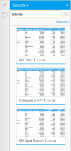
There are three different types of KPI Report available in Yellowfin:
Spot | Basic KPI Report that allows you to set up a KPI without displaying any additional information, other than the value itself. |
Categorical | KPI Report that splits what's displayed on the tab into categories when viewed as a report. This allows you to display break up the value into categories for further examination. |
Time | KPI Report that allows you to show a trend according to time series data, rather than real-time trends. It also allows you to show more detail in the report (like a Categorical KPI). |
You will need to create at least one of these before attempting this tutorial.
See KPI Report Tutorial for more information.
スポット | 基本的なKPIレポート。値以外の追加情報を表示せずにKPIを設定できます。 |
カテゴリー別 | 1つのレポートとして表示されるときに、タブの表示内容をカテゴリー別に分割したKPIレポート。値を詳細に調べるために、カテゴリーに分けて表示することができます。 |
時間 | リアルタイムの傾向ではなく、時系列のデータに従った傾向を表示できるKPIレポート。カテゴリー別KPIと同様に、追加の詳細をレポートで表示することができます。 |
このチュートリアルを行う前に、これらのうち1つ以上を作成しておく必要があります。
詳細については、KPIレポートのチュートリアルを参照してください。
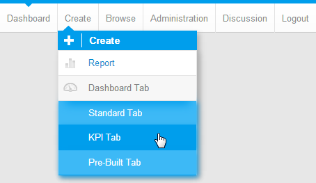
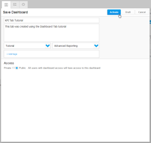
KPIタブの作成
...
| Styleclass | ||
|---|---|---|
|
...
| Section | ||||||||||
|---|---|---|---|---|---|---|---|---|---|---|
|

| Section | ||||||||||
|---|---|---|---|---|---|---|---|---|---|---|
|
| Section | ||||||||||
|---|---|---|---|---|---|---|---|---|---|---|
|

| Section | ||||||||||
|---|---|---|---|---|---|---|---|---|---|---|
|
| Section | ||||||||||
|---|---|---|---|---|---|---|---|---|---|---|
|
...
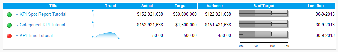
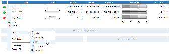
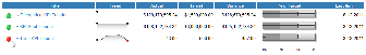
KPIタブの閲覧と利用
| Styleclass | ||
|---|---|---|
|
...
| Section | ||||||||||
|---|---|---|---|---|---|---|---|---|---|---|
|

| Section | ||||||||||
|---|---|---|---|---|---|---|---|---|---|---|
|
| Section | ||||||||||
|---|---|---|---|---|---|---|---|---|---|---|
|
| Section | ||||||||||
|---|---|---|---|---|---|---|---|---|---|---|
|
| Section | ||||||||||
|---|---|---|---|---|---|---|---|---|---|---|
|
| Section | ||||||||||
|---|---|---|---|---|---|---|---|---|---|---|
|
| horizontalrule |
|---|
| Styleclass | ||
|---|---|---|
|
...