Page History
...
| Styleclass | ||
|---|---|---|
| ||
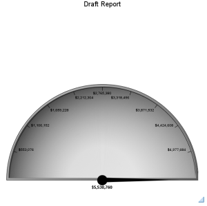
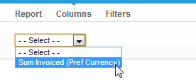
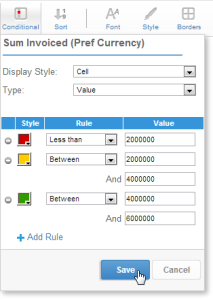
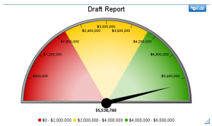
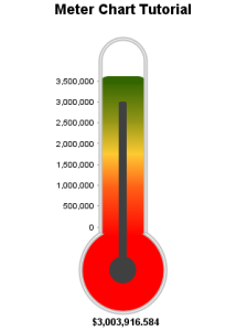
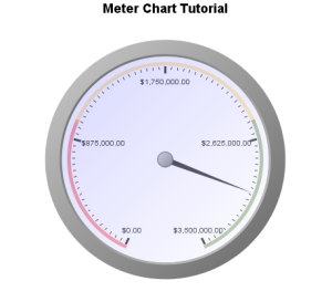
Meter Chart Tutorial
| Styleclass | ||
|---|---|---|
| ||
Summary
Tutorial
| Section | ||||||||||
|---|---|---|---|---|---|---|---|---|---|---|
|


| Section | ||||||||||
|---|---|---|---|---|---|---|---|---|---|---|
|
| Section | ||||||||||
|---|---|---|---|---|---|---|---|---|---|---|
|
| Section | ||||||||||
|---|---|---|---|---|---|---|---|---|---|---|
|
| Section | ||||||||||
|---|---|---|---|---|---|---|---|---|---|---|
|

| Section | ||||||||||
|---|---|---|---|---|---|---|---|---|---|---|
|
| Section | ||||||||||
|---|---|---|---|---|---|---|---|---|---|---|
|
| Section | ||||||||||
|---|---|---|---|---|---|---|---|---|---|---|
|
| Section | ||||||||||
|---|---|---|---|---|---|---|---|---|---|---|
|
| Section | |||||
|---|---|---|---|---|---|
|
| Section | |||||
|---|---|---|---|---|---|
|
| horizontalrule |
|---|
| Styleclass | ||
|---|---|---|
| ||
...
| Styleclass | ||
|---|---|---|
| ||
| Styleclass | ||
|---|---|---|
| ||
| Section | ||||||||||
|---|---|---|---|---|---|---|---|---|---|---|
|
| Section | ||||||||||
|---|---|---|---|---|---|---|---|---|---|---|
|
| Section | ||||||||||
|---|---|---|---|---|---|---|---|---|---|---|
|
| Section | ||||||||||
|---|---|---|---|---|---|---|---|---|---|---|
|
| Section | ||||||||||
|---|---|---|---|---|---|---|---|---|---|---|
|
| Section | ||||||||||
|---|---|---|---|---|---|---|---|---|---|---|
|
| Section | ||||||||||
|---|---|---|---|---|---|---|---|---|---|---|
|
| Section | ||||||||||
|---|---|---|---|---|---|---|---|---|---|---|
|
| Section | ||||||||||
|---|---|---|---|---|---|---|---|---|---|---|
|
| Section | |||||
|---|---|---|---|---|---|
|
| Section | |||||
|---|---|---|---|---|---|
|
| horizontalrule |
|---|
| Styleclass | ||
|---|---|---|
| ||