30日間の無料評価版をお試しいただけます。

Versions Compared

Key

  • This line was added.
  • This line was removed.
  • Formatting was changed.

...

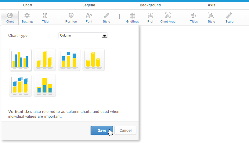
One of the features of Yellowfin is that even after you have made a selection it is easy to swap between chart types to see how your data might look with different visualisations.

Expand
titleAnalytical

Type

Icon

When to Use

Bubble

Image Added

Can be used with categorical, sequential or time-series data. Bubble size and location combine to effectively display 3-D data on a 2-D chart. Bubble charts can also be displayed in quadrants, allowing for negative X and Y values.

Scatter

Image Added

A scatter plot (points not joined) chart that allows the charting of 2 related attribute series. Can only be used if the data series are related. Useful for seeing trends in data that is not linear.

Histogram

Image Added

Shows the number of times a given value occurs in the dataset.

Box & Whisker

Image Added

A chart which gives a quick overview of series of values and their statistical properties.

Trellis

Image Added

A segmented chart for which the behaviour is determined by the data selected.

Heat Grid

Image Added

Plots the intensity of a metric across multiple categories.

Expand
titleArea Charts

Type

Icon

When to Use

Area

You want to emphasize the magnitude of change over time. Use an area chart to show how much the value of a measure changes over time.

Stacked Area

You want to emphasise the magnitude of change over time, while comparing multiple categories.

...

Expand
titleMaps

Type

Icon

When to Use

Image Maps

If you do not have GIS defined columns you can use the Image Maps to create heat maps - these are a good way to display metrics with a spatial element such as Revenue by State or Country
You will only be able to render maps for which an image map has been defined.

Google Maps

Google Maps allow you to render location data points onto a Google map which will be displayed as a Yellowfin Chart - along with associated Google map widgets.
You will have to have a Google Map Key to use this type of chart

GIS Google Maps

Image Added

A Google map which uses GIS data for its marker coordinates.

GIS Maps

GIS Maps allow the rendering of complex GIS polygons. These can be used to render spatial reports on the fly based on the GIS data available in a report.

GIS Bubble Map

A bubble map in which bubble positions are specified by GIS points.

GIS Heat Map

A heat map where colours representing GIS points are blended based on intensity.

...

Expand
titlePie Charts

Type

Icon

When to Use

Pie

You want to show the relationship of parts to the whole. Use a pie chart to highlight proportions rather than actual values. If it is important to show actual values in the chart, avoid using the pie chart type.

3D Pie

Similar to the pie chart, but in three a dimensional form.

Multi Pie

Used to highlight individual component sizes in a system of multiple components.

Ring

Similar to the pie chart, but in a circular ring form.

Expand
titleSpecial Purpose Charts

Type

Icon

When to Use

Funnel

Image Modified

Used to show the status of stages in a process.

Proportional Infographic

Image Added

Displays segments on an image, with the segment size representing metric value.

Comparative Infographic

Image Added

Displays images sized in such a way to correspond to a metric.

Radar

Image Modified

You want to compare data by integrating multiple axes into a single radial figure.

Waterfall

Image Modified

Waterfall charts are a special type of Floating Column Chart. A typical waterfall chart shows how an initial value is increased and decreased by a series of intermediate values, leading to a final value.

Event

Image Modified

Maps the occurrence of events against the values of a numeric data set over time.

Week Density

Image Modified

Shows the density of occurrences based on hour relative to other densities on the same day of the week

...

Trellis

...

Image Removed

...

A segmented chart for which the behaviour is determined by the data selected.

...

titleStatistical Charts

...

Type

...

Icon

...

When to Use

...

Bubble

...

Image Removed

...

Can be used with categorical, sequential or time-series data. Bubble size and location combine to effectively display 3-D data on a 2-D chart. Bubble charts can also be displayed in quadrants, allowing for negative X and Y values.

...

Scatter

...

Image Removed

...

A scatter plot (points not joined) chart that allows the charting of 2 related attribute series. Can only be used if the data series are related. Useful for seeing trends in data that is not linear.

...

Histogram

...

Image Removed

...

Shows the number of times a given value occurs in the dataset.

...

Box & Whisker

...

Image Removed

...

.

Chart Selector

Styleclass
ClasstopLink

top

...